In a previous analysis we discovered that the most common reason users gave for churning was that they weren’t using, or didn’t need, Buffer.
I was inspired by this blog post by Intercom’s Chief Strategy Officer to conduct an audit of the features available to Buffer for Business users in order to see which were being used, and how frequently.
In this post, we will analyze a subset of our features with two simple criteria: how many users use it and how frequently. Then we could theoretically place each feature on a two-dimensional graph like this one:
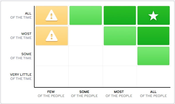
The author claims that the features in the top-right quadrant of the graph make up the core of the product, whereas features laying in other quadrants need to be improved, promoted, or removed.
These are the features we’ll analyze:
- The web composer
- The browser extension
- The posts analytics tab
- The overview analytics tab
- Calendar
- RSS Feeds
Each of these features have a group events associated with the core value of the feature. For example, scheduling an update from the web composer would be the main event associated with that feature.
Let’s go ahead and collect the feature usage data for Business customers.
Data collection
Let’s query the Redshift table actions_taken to find the events associated with each user and each feature that we’re interested in analyzing. We’ll use the buffer R package to do this.
select
  a.user_id
  , date_trunc('week', u.created_at) as user_created_week
  , a.full_scope
  , u.billing_plan
  , date_trunc('week', a.date) as week
  , count(distinct a.id) as actions
from actions_taken as a
left join users as u
  on a.user_id = u.user_id
where u.billing_plan != 'individual'
  and u.billing_plan != 'awesome'
  and u.billing_plan != 'new_awesome'
  and u.billing_plan != '1'
  and u.billing_plan is not null
  and (full_scope like 'dashboard updates shared%'
    or full_scope like 'extension composer multiple-composers updates shared%'
    or full_scope = 'dashboard viewed sent_posts'
    or full_scope = 'dashboard analytics overview viewed'
    or full_scope = 'dashboard updates shared feeds'
    or full_scope = 'dashboard feeds added_feed'
    or full_scope like 'dashboard calendar update%'
    or full_scope = 'dashboard calendar week clicked add_post')
  and date >= (current_date - 180)
group by 1, 2, 3, 4, 5
We now have a dataframe containing 360 thousand unique user-week-feature combinations. There are over 7000 Business customers in this dataset.
Now we need to collect data from the updates table to determine how many Business users scheduled updates from one of the mobile apps each week.
select
  up.user_id
  , date_trunc('week', up.date) as week
  , count(distinct up.id) as update_count
from updates as up
left join users as u
  on up.user_id = u.user_id
where up.client_id in ('4e9680b8512f7e6b22000000','4e9680c0512f7ed322000000')
  and u.billing_plan != 'individual'
  and u.billing_plan != 'awesome'
  and u.billing_plan != 'new_awesome'
  and u.billing_plan != '1'
  and u.billing_plan is not null
  and up.date >= (current_date - 180)
group by 1, 2
To compute the proportions, we’ll need to collect a bit more data. We need the total number of active users for each week. We will define active as having at least 20 events in the actions_taken table in a given week.
select
  a.user_id
  , u.created_at
  , u.billing_plan
  , date_trunc('week', a.date) as week
  , count(distinct a.id) as total_actions
from actions_taken as a
left join users as u
  on a.user_id = u.user_id
where u.billing_plan != 'individual'
  and u.billing_plan != 'awesome'
  and u.billing_plan != 'new_awesome'
  and u.billing_plan != '1'
  and u.billing_plan is not null
  and date >= (current_date - 180)
group by 1, 2, 3, 4
having count(distinct a.id) >= 20
Now we have the total number of Business customers that were active each week in the past 6 months. Now, we just need to do a bit of cleaning to make sure we have a representative sample of our target population (Business customers).
We need to make sure that the users in our datasets are actual Business customers and not just Business trialists. Trialists have Business plans listed in their Mongo user object, so we need to make sure that there is actually a successful charge associated with the user. To do that, we’ll find the number of successful charges for all users in the past year, and inner_join it with our current datasets. We’ll use the following query:
select
    c.customer
    , u.user_id
    , count(distinct c.id) as charges
from stripe._charges as c
inner join users as u
    on u.billing_stripe_id = c.customer
left join stripe._invoices as i
    on c.invoice = i.id
left join stripe._subscriptions as s
    on i.subscription_id = s.id
where c.captured = TRUE
and c.created >= (current_date - 365)
and s.plan_id != 'pro-monthly'
and s.plan_id != 'pro-annual'
and s.plan_id not like '%awesome%'
group by 1, 2
Now we need to join the number of successful charges into our feature_usage and total_usage dataframes.
# join feature usage and charges
feature_usage <- feature_usage %>%
  inner_join(charges, by = 'user_id')

# join total usage and charges
total_usage <- total_usage %>%
  inner_join(charges, by = 'user_id')
Alright, we’re getting closer. :)
Data tidying
We saved the results of the first query in a dataframe called feature_usage.We need to gather the full_scope values and determine which features they correspond to. For example, we need to know that dashboard updates shared composer now is associated with the main dashboard feature, and so forth.
# determine the feature corresponding with full scope
overview <- grepl('dashboard analytics overview', feature_usage$full_scope)
posts <- grepl('sent_posts', feature_usage$full_scope)
feeds <- grepl('dashboard feeds', feature_usage$full_scope)
dashboard <- grepl('dashboard updates shared', feature_usage$full_scope)
extension <- grepl('extension', feature_usage$full_scope)
calendar <- grepl('calendar', feature_usage$full_scope)

# assign the feature
feature_usage$feature <- ""
feature_usage[overview, ]$feature <- 'overview'
feature_usage[posts, ]$feature <- 'posts'
feature_usage[feeds, ]$feature <- 'feeds'
feature_usage[dashboard, ]$feature <- 'dashboard'
feature_usage[extension, ]$feature <- 'extension'
feature_usage[calendar, ]$feature <- 'calendar'
Now we have to group the data by feature and week, so that we can see the number of users that used each feature, each week. We will join this dataframe to another dataframe that includes the total number of active users for each week, so that we can calculate the percentage of weekly active users that used each feature.
# group by feature and week
weekly_feature_usage <- feature_usage %>%
  group_by(week, feature) %>%
  summarise(users = n_distinct(user_id), actions = sum(actions))

# group total usage by week
weekly_usage <- total_usage %>%
  group_by(week) %>%
  summarise(total_users = n_distinct(user_id))

# join in weekly active user counts
weekly_feature_usage <- weekly_feature_usage %>%
  inner_join(weekly_usage, by = 'week') %>%
  mutate(user_percent = users / total_users)
We are ready for some exploratory analysis.
Exploratory analysis
Let’s plot the percentage of WAU that used each feature, each week.
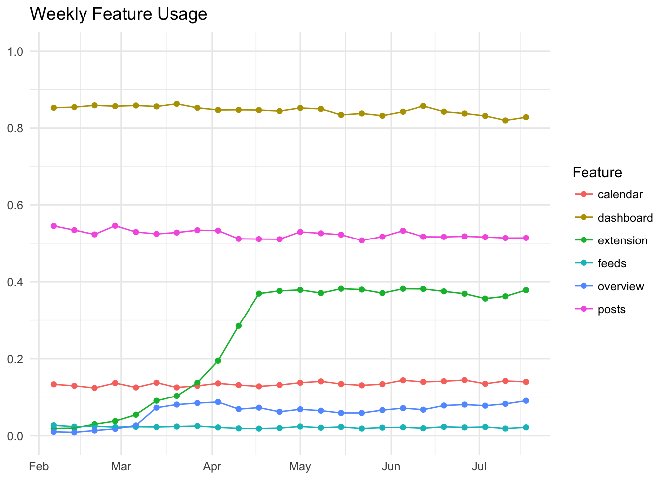
Around 75-80% of weekly active users, defined as users that took at least 10 actions in a given week, schedule updates with the dashboard composer. It’s interesting to see that this percentage has declined somewhat in recent weeks, but we will ignore that for now.
Around 45-50% of WAU viewed the Posts tab. This is a high percentage, but it makes sense when you realize that the Posts tab is the default tab under the main Analytics tab.
Around 35% of WAU schedule updates with the extension each week. We can see this percentage start close to 0 and creep up to around 35% in mid April - this is around the time that we rolled the feature out to Business customers.
Around 12% of WAU use the Calendar feature, around 7% of WAU view the Overview tab each week, and only around 2% of WAU schedule an update with Feeds or add a new feed.
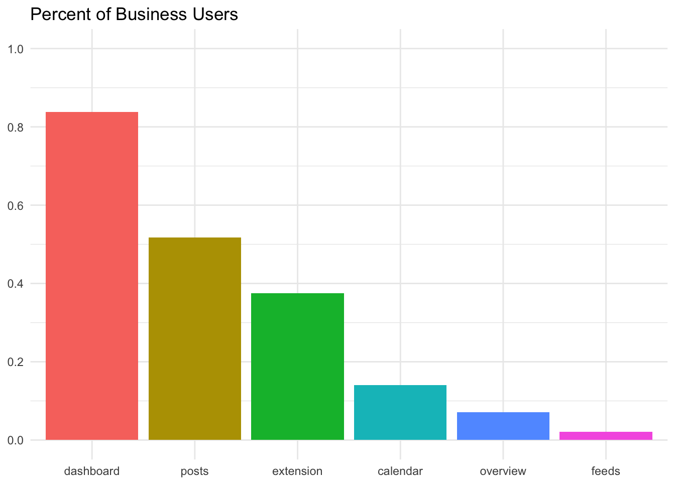
These percentages appear relatively stable across time, except for the Overview tab and extension, which are relatively new features. We can plot the median percent of WAU that use each feature in a bar graph.
Alright. Now let’s see if we can estimate the frequency of usage for each feature. To do this, we will need to count the number of weeks each user used each feature.
# group by user
features_by_user <- feature_usage %>%
  group_by(user_id, user_created_week, feature) %>%
  summarise(weeks_using_feature = n_distinct(week))
Now we need to find the maximum number of possible weeks that these users could have used each feature. In the end we’ll divide the number of weeks each customer used each feature by the number of possible weeks, to get a percentage.
# get min and max weeks
min_week <- min(feature_usage$week)
max_week <- max(feature_usage$week)
distinct_weeks <- n_distinct(feature_usage$week)

# calculate weeks since joining
features_by_user <- features_by_user %>%
  mutate(old_user = user_created_week < min_week) %>%
  mutate(possible_weeks = ifelse(old_user, distinct_weeks,
                                 as.numeric((max_week - user_created_week) / 7) + 1)) %>%
  mutate(percent_of_weeks = weeks_using_feature / possible_weeks)
Now we can plot the median percentage of weeks used for each feature.
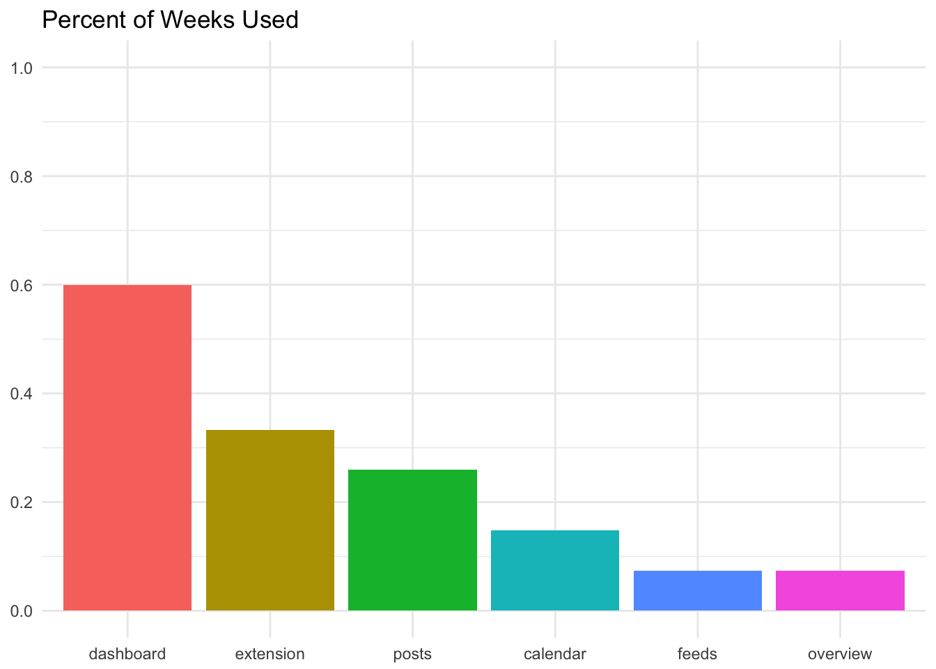
It’s important to note that these distributions (the percentage of possible weeks that a feature is used) are not normally distributed, so the median might not be the best summary statistic to use here. I thought they would be useful to use to compare usage across features though, so here we are. :)
Let’s try to recreate that two-dimensional plot from the beginning of this post.
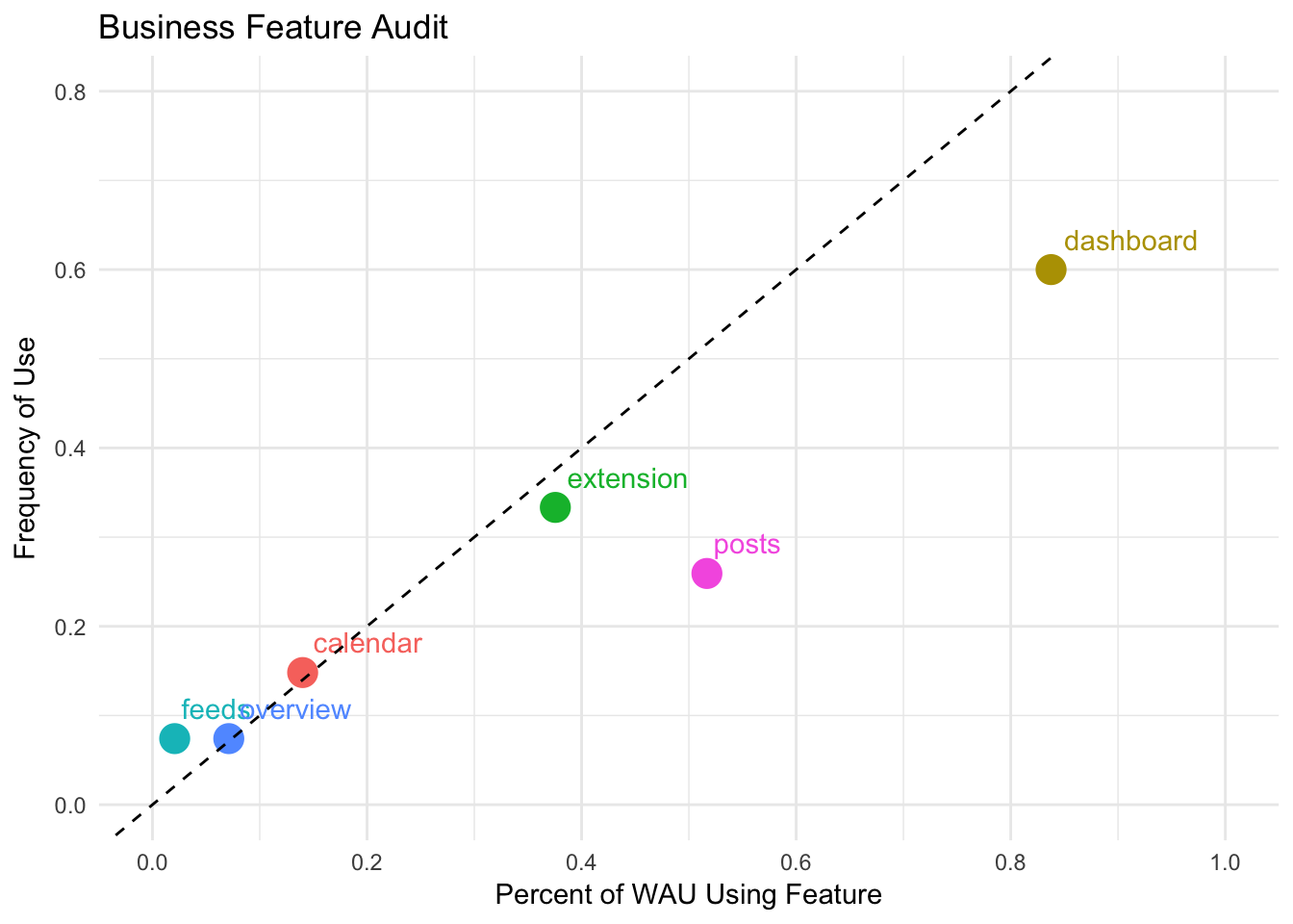
It looks like the dashboard is the only feature in the top-right quadrant, which makes it the core of the product. This isn’t surprising, but it is interesting to see where the other features lie on the graph. Features that are towards the left of the graph have low adoption.
The dashed line cuts represents the point at which the percentage of WAUs using a feature equals the percent of weeks that WAUs use the feature.
Improving adoption
For any given feature with limited adoption, you have 4 choices:
- Kill it: admit defeat, and start to remove it from your product
- Increase the adoption rate: Get more people to use it
- Increase the frequency: Get people to use it more often
- Deliberately improve it: Make it quantifiably better for those who use it
To make the right decision, we’d likely want to look deeper into usage and find out why it has limited adoption.
That might look something like this:
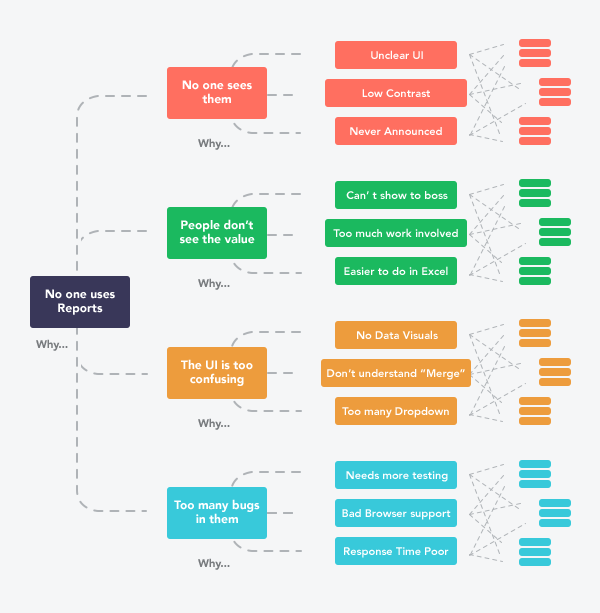
Adoption of the Overview tab might be so low because it’s difficult to find, or perhaps people don’t see the value in it, or perhaps it’s too inaccurate. Each reason will have it’s own set of actions we could take to improve adoption.
Improving frequency presents a different challenge, but I think it can also be addressed!