People decide to leave or stop paying for Buffer every day. It’s unfortunate, but it happens for one reason or another.
We collect a lot of data from these users in the form of surveys. We thought that it might be beneficial to analyze the text of these survey comments to see if we can identify common themes that we could address.
Data collection
We’ll use data collected from four separate surveys that represents different types of churn:
- The exit survey prompts users to explain why they are abandoning the Buffer product completely.
- The business churn survey prompts users to explain why they are canceling their business subscriptions.
- The awesome downgrade survey prompts users to explain why they are canceling their awesome subscriptions.
- The business downgrade awesome survey asks why users downgrade from a Business to an Awesome subscription.
We’ve gathered the data in this look. We can use the get_look() function from the buffer package to import all of the survey responses into an R dataframe.
# Get churn responses
responses <- get_look(3949)
Great, we have over 30,000 survey responses! We’ll need to clean the data up a bit to get it ready for analysis.
library(lubridate)## Loading required package: methods##
## Attaching package: 'lubridate'## The following object is masked from 'package:base':
##
## date# Rename columns
colnames(responses) <- c('created_at', 'user_id', 'type', 'reason', 'specifics', 'details')
# Set strings as character type
responses$details <- as.character(responses$details)
# Set date as date
responses$created_at <- as.Date(responses$created_at, format = '%Y-%m-%d')
# Get the month
responses <- responses %>%
mutate(month = as.Date(paste0(format(created_at, "%Y-%m"), '-01'), format = '%Y-%m-%d'))
# Remove the respon and specifics columns
responses$reason <- NULL
responses$specifics <- NULL
# Remove NA values
responses <- responses %>%
filter(details != "" & details != '[No reason supplied]' & details != 'false')After cleaning the data, we still have around 16 thousand responses from November 2015 to July 2017 to work with.
Data tidying
Here is some context on the idea of tidy data taken from the book Tidy Text Mining with R:
Using tidy data principles is a powerful way to make handling data easier and more effective, and this is no less true when it comes to dealing with text. As described by Hadley Wickham (Wickham 2014), tidy data has a specific structure: - Each variable is a column - Each observation is a row - Each type of observational unit is a table
We thus define the tidy text format as being a table with one-token-per-row. A token can be a word or an n-gram. Within our tidy text framework, we need to both break the comments into individual tokens and transform it to a tidy data structure.
To do this, we use tidytext’s unnest_tokens() function. This breaks the churn survey responses into individual words and includes one word per row while retaining the attributes (survey type, user_id, etc) of that word.
# Unnest the tokens
text_df <- responses %>%
  unnest_tokens(word, details)
Now that the data is in one-word-per-row format, we can manipulate it with tidy tools like dplyr. Often in text analysis, we will want to remove stop words; stop words are words that are not useful for an analysis, typically extremely common words such as “the”, “of”, “to”, and so forth in English. We can remove stop words (kept in the tidytext dataset stop_words) with an anti_join().
# Collect stop words
data(stop_words)

# Remove stop words from our dataset with an anti_join()
text_df <- text_df %>%
  anti_join(stop_words, by = "word")
Great! We’ve got a tidy data frame now.
Data exploration
Let’s take a moment here to see the most common words overall from the churn surveys.
# Find most common words
text_df %>%
  count(word, sort = TRUE) %>%
  filter(n > 200) %>%
  mutate(word = reorder(word, n)) %>%
  ggplot(aes(word, n)) +
  geom_col() +
  labs(x = "", y = "", title = "Most Common Words") +
  coord_flip()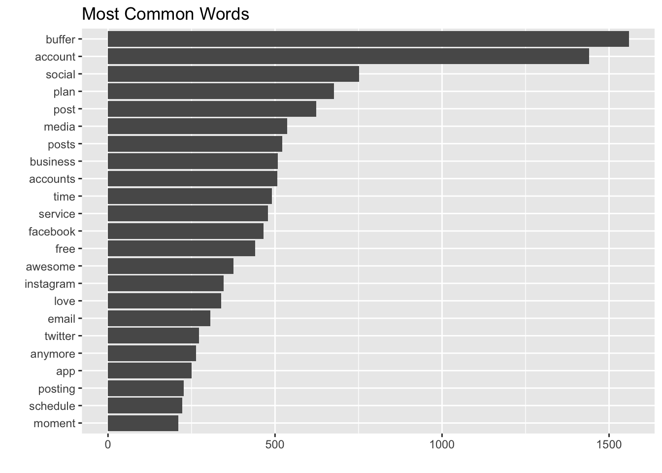
It’s interesting to see “plan” used so frequently. Words like “post”, “time”, and “facebook” may be possible signals as well. It’s nice to see “love” in there as well.
Ok, we can now look for the words that occur more frequently in the business churn survey, relative to other surveys.
To find these words, we can calculate the relative frequency of words that appear in the business churn survey and compare that to the relative frequency of the words in the other surveys.
library(tidyr)

# Calculate relative frequency of words
frequency <- text_df %>%
  filter(!(is.na(type)) & type != "") %>%
  count(type, word) %>%
  group_by(type) %>%
  mutate(proportion = n / sum(n)) %>%
  select(-n) %>%
  spread(type, proportion) %>%
  gather(segment, proportion,
         c(awesome_downgrade_survey, business_downgrade_awesome_survey:exit_survey))

# Replace NA with 0
frequency[is.na(frequency)] <- 0
Now we can plot the relative frequencies of popular words, to help us visualize the relative frequencies.
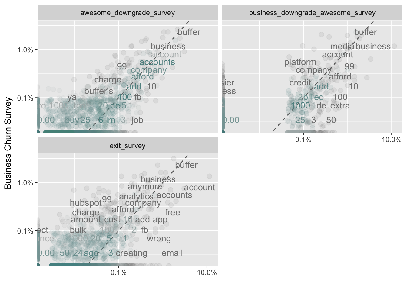
Words that are close to the dotted line in these plots have similar frequencies in both sets of comments. For example, in both the business churn survey and the awesome downgrade survey, the terms “accounts”, “love”, and “afford” are used frequently.
Words that are far from the line are words that are found more in one set of comments than another. Words on the left side of the dotted line occur more frequently in the business churn survey’s comments than in the other surveys. For example, in the awesome_downgrade_survey panel, words like “expensive”, “reporting”, and “analytcs” are much more common in the business churn survey than in the awesome survey.
In the exit survey, words like “free”, “wrong”, “email”, and “connected” appear more frequently than in the business churn survey.
Diving deeper into word frequency
Another way to analyze a term’s relative frequency is to calculate the inverse document frequency (tdf), which is defined as:
idf(term) = ln(documents / documents containing term)
A term’s inverse document frequency (idf) decreases the weight for commonly used words and increases the weight for words that are not used very much. This can be combined with term frequency to calculate a term’s tf-idf (the two quantities multiplied together), the frequency of a term adjusted for how rarely it is used.
The idea of tf-idf is to find the important words for the content of each collection of words (the surveys being the collections of words) by decreasing the weight for commonly used words and increasing the weight for words that are not used very much in an entire collection of documents, in this case the text of all of the surveys combined.
The bind_tf_idf function takes a tidy text dataset as input with one row per token (word), per document. One column (word here) contains the terms, one column contains the documents (type here), and the last necessary column contains the counts, how many times each document contains each term (n).
# Calculate the frequency of words for each survey
survey_words <- text_df %>%
  count(type, word, sort = TRUE) %>%
  ungroup()

# Calculate the total number of words for each survey
total_words <- survey_words %>%
  group_by(type) %>%
  summarize(total = sum(n))

# Join the total words back into the survey_words data frame
survey_words <- left_join(survey_words, total_words, by = "type") %>%
  filter(type != "")

# View data
head(survey_words)
## # A tibble: 6 x 4
## type word n total
## <fctr> <chr> <int> <int>
## 1 exit_survey account 1142 16680
## 2 awesome_downgrade_survey buffer 890 22688
## 3 exit_survey buffer 572 16680
## 4 awesome_downgrade_survey social 474 22688
## 5 awesome_downgrade_survey plan 469 22688
## 6 awesome_downgrade_survey media 358 22688There is one row in this data frame for each word-survey combination. n is the number of times that word is used in that survey and total is the total number of words in the survey responses.
The bind_tf_idf function
The idea of tf-idf is to find the important words for the content of each collection of comments by decreasing the weight for commonly used words and increasing the weight for words that are not used very much in an entire collection of documents, in this case all survey responses.
# Calculate tf_idf
survey_words <- survey_words %>%
  bind_tf_idf(word, type, n)

head(survey_words)
## # A tibble: 6 x 7
## type word n total tf idf
## <fctr> <chr> <int> <int> <dbl> <dbl>
## 1 exit_survey account 1142 16680 0.06846523 0.2231436
## 2 awesome_downgrade_survey buffer 890 22688 0.03922779 0.2231436
## 3 exit_survey buffer 572 16680 0.03429257 0.2231436
## 4 awesome_downgrade_survey social 474 22688 0.02089210 0.2231436
## 5 awesome_downgrade_survey plan 469 22688 0.02067172 0.2231436
## 6 awesome_downgrade_survey media 358 22688 0.01577927 0.2231436
## # ... with 1 more variables: tf_idf <dbl>The idf and tf_idf will be 0 for common words like “the” and “a”. We’ve already removed these stop words from our dataset.
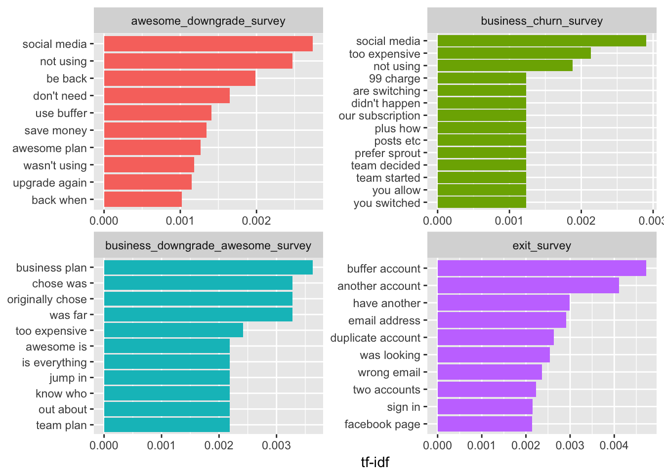
Let’s visualize these high tf_idf words for each type of churn survey.
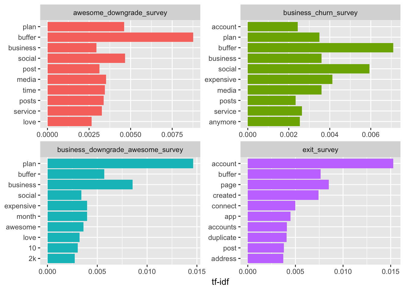
The words that appear in these graphs appear more frequently in the specific survey type than they do in the other surveys. I think we can ignore “buffer”. The word “plan” seems to appear often in each survey except the exit survey as well. The term “expensive” appears more often in the business churn survey and the business downgrade awesome survey. It might be worth noting that “media” and “anymore” appear more frequently in the business churn survey than the other surveys.
We don’t have much context and are required to speculate on what the meaning and emotion behind the words might be. It may be beneficial to look at groups of words to help us gather more information. :)
N-grams
What if we looked at groups of words instead of just single words? We can check which words tend to appear immediately after another, and which words tend to appear together in the same document.
We’ve been using the unnest_tokens function to tokenize by word, but we can also use the function to tokenize into consecutive sequences of words, called n-grams. By seeing how often word X is followed by word Y, we can then build a model of the relationships between them.
We do this by adding the token = "ngrams" option to unnest_tokens(), and setting n to the number of words we wish to capture in each n-gram. When we set n to 2, we are examining groups of 2 consecutive words, often called “bigrams”:
# Unnest bigrams from responses
bigrams <- responses %>%
  unnest_tokens(bigram, details, token = "ngrams", n = 2)

# View the bigrams
head(bigrams$bigram)
## [1] "mainly 2" "2 reasons" "reasons n1" "n1 the" "the mobile"
## [6] "mobile app"Great! Each token now is represented by a bigram. Let’s take a quick look at the most common bigrams
# Count the most common bigrams
bigrams %>%
  count(bigram, sort = TRUE)
## # A tibble: 42,210 x 2
## bigram n
## <chr> <int>
## 1 social media 524
## 2 i am 421
## 3 i have 418
## 4 i don't 410
## 5 need to 373
## 6 not using 373
## 7 using it 356
## 8 i was 327
## 9 to use 309
## 10 i need 303
## # ... with 42,200 more rowsAs we might expect, a lot of the most common bigrams are groups of common words. This is a useful time to use tidyr’s separate(), which splits a column into multiple based on a delimiter. This lets us separate it into two columns, “word1” and “word2”, at which point we can remove cases where either is a stop-word.
# Separate words in bigrams
separated <- bigrams %>%
  separate(bigram, c("word1", "word2"), sep = " ")

# Define our own stop words
word <- c("i", "i'm", "it", "the", "at", "to", "right", "just", "to", "a", "an",
          "that", "but", "as", "so", "will", "for", "longer", "i'll", "of", "my",
          "n", "do", "did", "am", "with", "been", "and", "we")

# Create tibble of stop words
stopwords <- tibble(word)

# Filter out stop-words
filtered <- separated %>%
  filter(!word1 %in% stopwords$word) %>%
  filter(!word2 %in% stopwords$word)

# Calculate new bigram counts
bigram_counts <- filtered %>%
  count(word1, word2, sort = TRUE)

head(bigram_counts)
## # A tibble: 6 x 3
## word1 word2 n
## <chr> <chr> <int>
## 1 social media 524
## 2 not using 373
## 3 don't need 300
## 4 be back 299
## 5 awesome plan 207
## 6 another account 171We’ll use tidyr’s unite() function to recombine the columns into one.
# Reunite the words
bigrams_united <- filtered %>%
  unite(bigram, word1, word2, sep = " ")

head(bigrams_united$bigram)
## [1] "mainly 2" "2 reasons" "reasons n1" "mobile app" "app is"
## [6] "is buggy"Nice! Let’s look at the most common bigrams.
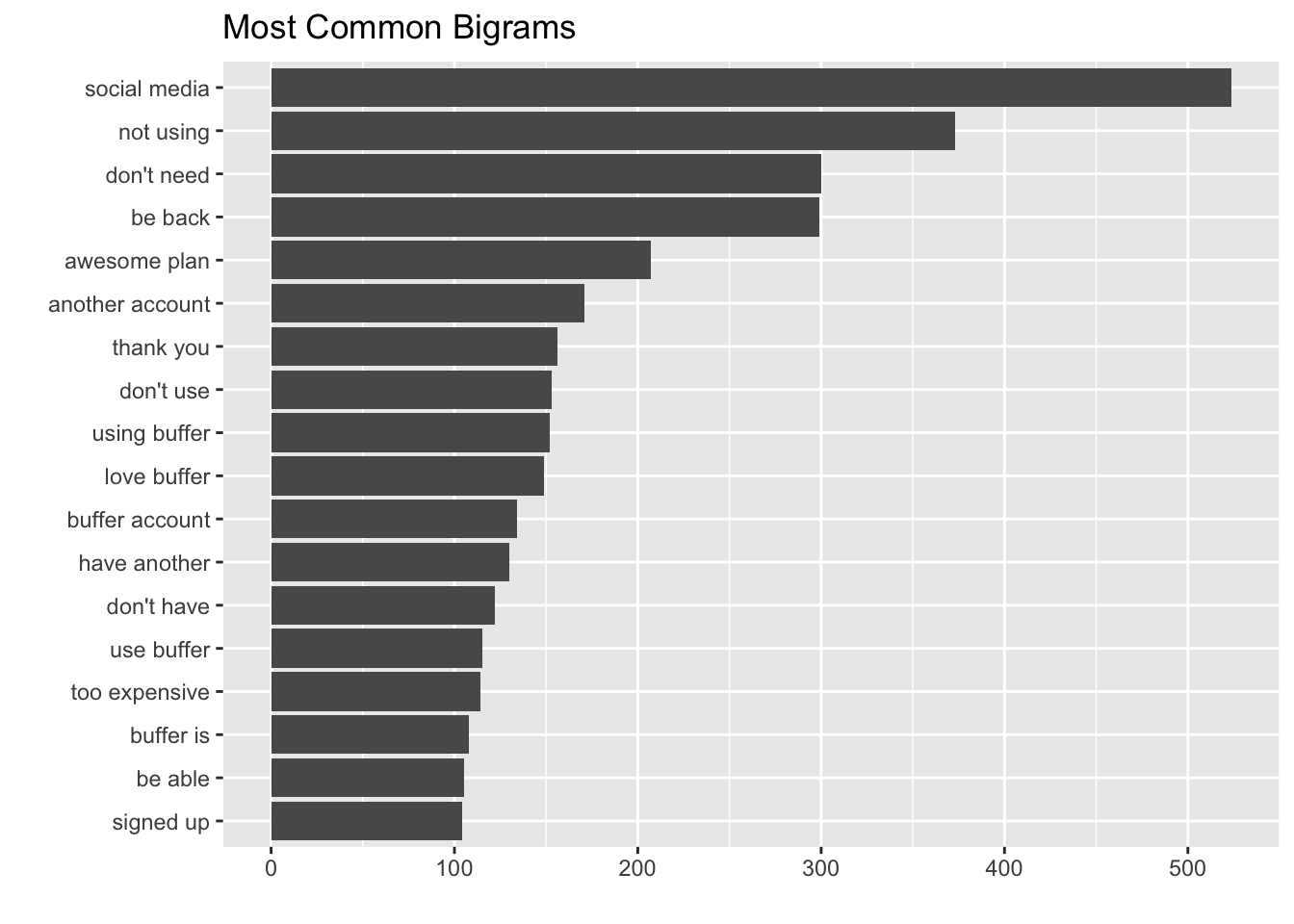
The most common bigram is “social media”, which makes sense. It’s more interesting to see that the next two most common bigrams are “not using” and “don’t need”. This seems like a clear signal that Buffer wasn’t filling these users’ needs in one way or another, which led them to leaving the product.
Bigrams like “be back”, “another account”, and “have another” indicate that these users either have another Buffer account, or need to stop using it only temporarily.
A bigram can also be treated as a term in a document in the same way that we treated individual words. For example, we can look at the tf-idf of these trigrams across the surveys. These tf-idf values can be visualized within each segment, just as we did for words earlier.
These bigrams give us slightly more context about what users are thinking in each survey. Responses from the business churn survey and business downgrade survey emphasize how expensive the plan is. They also mention a competitor, Sprout. Responses from the exit survey indicate account confusion.
We may want to visualize the relationship between these bigrams, instead of just listing the most common ones.
Visualizing a network of bigrams with ggraph
As one common visualization, we can arrange the words into a network, or “graph.” Here we’ll be referring to a “graph” not in the sense of a visualization, but as a combination of connected nodes. A graph can be constructed from a tidy object since it has three variables:
- from: the node an edge is coming from
- to: the node an edge is going towards
- weight: A numeric value associated with each edge
The igraph package has many powerful functions for manipulating and analyzing networks. One way to create an igraph object from tidy data is the graph_from_data_frame() function, which takes a data frame of edges with columns for “from”, “to”, and edge attributes (in this case n):
library(igraph)

# Original counts
head(bigram_counts)
## # A tibble: 6 x 3
## word1 word2 n
## <chr> <chr> <int>
## 1 social media 524
## 2 not using 373
## 3 don't need 300
## 4 be back 299
## 5 awesome plan 207
## 6 another account 171Let’s create a bigram graph object.
# filter for only relatively common combinations
bigram_graph <- bigram_counts %>%
  filter(n > 40) %>%
  graph_from_data_frame()

bigram_graph
## IGRAPH DN-- 73 75 --
## + attr: name (v/c), n (e/n)
## + edges (vertex names):
## [1] social ->media not ->using don't ->need
## [4] be ->back awesome ->plan another ->account
## [7] thank ->you don't ->use using ->buffer
## [10] love ->buffer buffer ->account have ->another
## [13] don't ->have use ->buffer too ->expensive
## [16] buffer ->is be ->able signed ->up
## [19] more ->than come ->back this ->account
## [22] is ->not this ->is you ->guys
## + ... omitted several edgesWe can convert an igraph object into a ggraph with the ggraph function, after which we add layers to it, much like layers are added in ggplot2. For example, for a basic graph we need to add three layers: nodes, edges, and text.
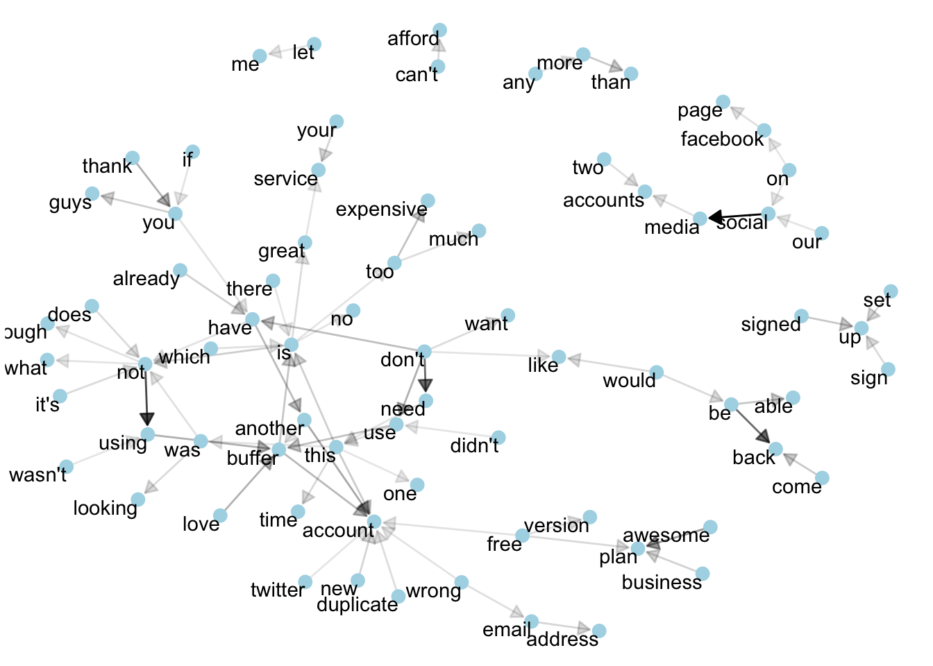
This is a visualization of a Markov chain, a model in text processing. In a Markov chain, each choice of word depends only on the previous word. In this case, a random generator following this model might spit out “buffer”, then “is”, then “great”, by following each word to the most common words that follow it. To make the visualization interpretable, I chose to show only the most common word to word connections. What can we learn from this graph?
We can use this graph to visualize some details about the text structure. For example, we can see that “buffer” and “account” form the centers of groups of nodes.
We also see pairs or triplets along the outside that form common short phrases (“can’t afford”, “too expensive”, or “don’t need”).
I see that “don’t” is at the center of a cluster of nodes. These include the phrases “don’t need”, “don’t want”, and “don’t have”.
What would this graph look like if we only looked at the responses of the business churn survey?
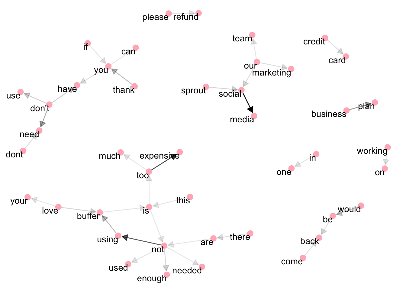
There are similar themes in this graph. Users simply aren’t using, or don’t need, Buffer. The term “not” is the center of a cluster of nodes including “using”, “used”, “enough”, and “needed”.
Cost is mentioned, as well as refunds. Sprout social is mentioned, as well as set up. Interestingly “come back” and “thank you” are also present.
Change over time
What words and topics have become more frequent, or less frequent, over time? These could give us a sense of what customers think about Buffer, and how that has changed.
We can first count the number of times each word is used each month, and then use the broom package to fit a logistic regression model to examine whether the frequency of each word increases or decreases over time. Every term will then have a growth rate (as an exponential term) associated with it.
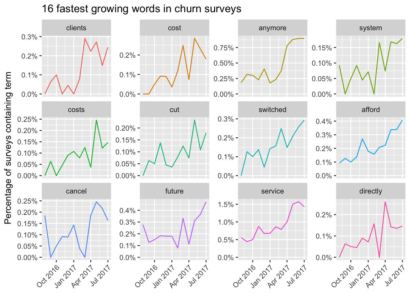
We can see the term “clients” has become much more frequent over time, especially since the beginning of 2017. This makes sense, as we have shift focus to be more business-focused. Terms about the cost of Buffer have also increased in frequency over time. The terms “cost”, “costs”, and “afford” have become much more frequent as time has gone on.
Negative words
Words like “not”, “don’t”, “can’t”, and “never” can be considered negative words. One thing we can do is look at the words that occur most frequently after these negative words.
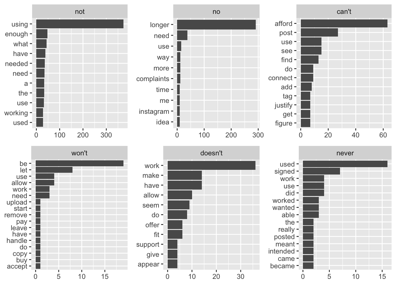
These plots can be informative for us. The most common terms after the word “not” are “using”, “enough”, “needed”, and “need”.
After the term “no”, “longer” is the most common, suggesting the terms “no longer need” or “no longer using”. After the term “can’t”, “afford” is the most common, followed by “post”, “use”, “find”, and “connect”.
After the word “won’t”, “let”, “use”, “allow”, “word”, “upload”, “start”, “remove”, and “need” appear, which indicates some problems with the product. After the word “doesn’t”, “work” is the most common, followed by “allow”, “do”, and “suppord”. The terms “used”, “signed”, “work” and “worked” appear most frequently after the term “never”.
Topic modeling
In analyzing these survey responses, we feel the urge to group words and responses into natural groups so that we can understand them separately. Topic modeling is a method for unsupervised classification of such documents, similar to clustering on numeric data, which finds natural groups of items even when we’re not sure what we’re looking for.
Latent Dirichlet allocation (LDA) is a particularly popular method for fitting a topic model. It treats each document as a mixture of topics, and each topic as a mixture of words. This allows documents to “overlap” each other in terms of content, rather than being separated into discrete groups, in a way that mirrors typical use of natural language.
LDA is a mathematical method for finding the mixture of words that is associated with each topic, while also determining the mixture of topics that describes each document.
We can use the LDA() function from the topicmodels package, setting k = 2, to create a two-topic LDA model.
library(topicmodels); library(tm)## Loading required package: NLP##
## Attaching package: 'NLP'## The following object is masked from 'package:ggplot2':
##
## annotate# Create a text corpus
corpus <- Corpus(VectorSource(text_df$word))
# Created a document term matrix
dtm <- DocumentTermMatrix(corpus)
# Find the sum of words in each Document
rowTotals <- apply(dtm , 1, sum)
# Remove all docs without words
dtm_new <- dtm[rowTotals > 0, ]
inspect(dtm_new)## <<DocumentTermMatrix (documents: 41348, terms: 5271)>>
## Non-/sparse entries: 41426/217903882
## Sparsity : 100%
## Maximal term length: 22
## Weighting : term frequency (tf)
## Sample :
## Terms
## Docs account accounts buffer business media plan post posts social time
## 138 0 0 0 0 0 0 0 0 0 0
## 219 0 0 0 0 0 0 0 0 0 0
## 2428 0 0 0 0 0 0 0 0 0 0
## 25 0 0 0 0 0 0 0 0 0 0
## 285 0 0 0 0 0 0 0 0 0 0
## 3 0 0 0 0 0 0 0 0 0 0
## 449 0 0 0 0 0 0 0 0 0 0
## 450 0 0 0 0 0 0 0 0 0 0
## 68 0 0 0 0 0 0 0 0 0 0
## 870 0 0 0 0 0 0 0 0 0 0# Set a seed so that the output of the model is predictable
lda <- LDA(dtm_new, k = 2, control = list(seed = 1234))
lda## A LDA_VEM topic model with 2 topics.Now that we’ve fit the LDA model, the rest of the analysis will involve exploring and interpreting the model using tidying functions from the tidytext package.
Word-topic probabilities
From the Tidy Text Mining with R book:
…the tidy() method, originally from the broom package (Robinson 2017), for tidying model objects. The tidytext package provides this method for extracting the per-topic-per-word probabilities, called ββ (“beta”), from the model.
topics <- tidy(lda, matrix = "beta")
topics
## # A tibble: 10,542 x 3
## topic term beta
## <int> <chr> <dbl>
## 1 1 spontaneously 1.791933e-05
## 2 2 spontaneously 3.034941e-05
## 3 1 teammate 4.696081e-05
## 4 2 teammate 1.355147e-06
## 5 1 com 2.312582e-03
## 6 2 com 7.785125e-04
## 7 1 mention 1.970841e-04
## 8 2 mention 1.409137e-04
## 9 1 integral 1.566107e-05
## 10 2 integral 3.260400e-05
## # ... with 10,532 more rowsThis has turned the model into a one-topic-per-term-per-row format. For each combination, the model computes the probability of that term being generated from that topic.
We could use dplyr’s top_n() to find the 10 terms that are most common within each topic.
# Find top terms
lda_top_terms <- topics %>%
  group_by(topic) %>%
  top_n(15, beta) %>%
  ungroup() %>%
  arrange(topic, -beta)

# Plot the results
lda_top_terms %>%
  mutate(term = reorder(term, beta)) %>%
  ggplot(aes(term, beta, fill = factor(topic))) +
  geom_col(show.legend = FALSE) +
  facet_wrap(~ topic, scales = "free") +
  coord_flip()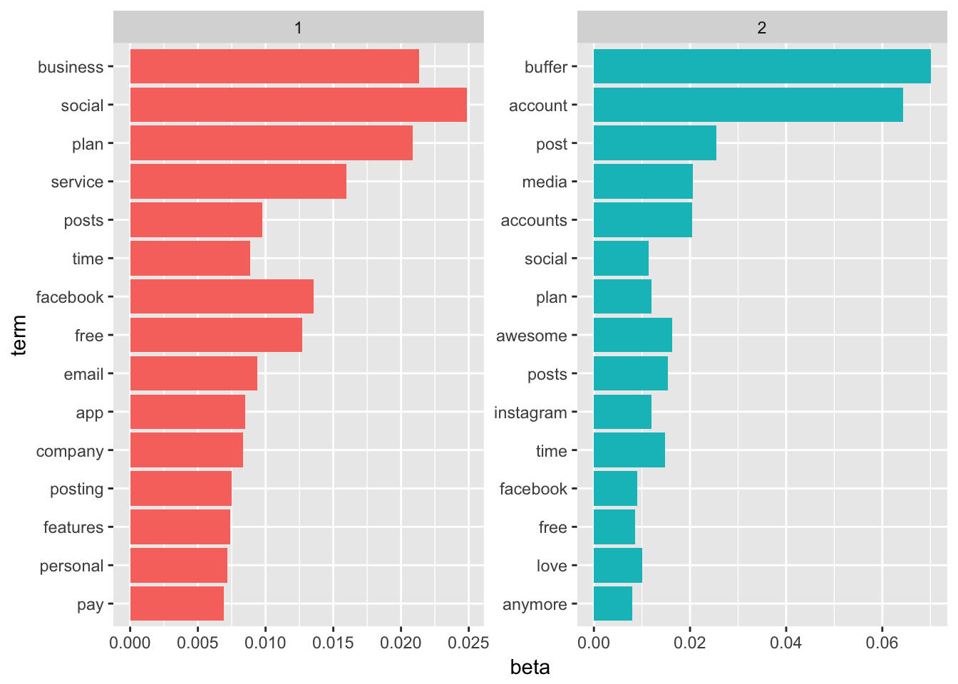
These graphs show the words that are most common in each topic. Notice that there is a lot of overlap – this is a feature of LDA.
As an alternative, we could consider the terms that had the greatest difference in β between topic 1 and topic 2. This can be estimated based on the log ratio of the two: log2(β2/β1) (a log ratio is useful because it makes the difference symmetrical: β2 being twice as large leads to a log ratio of 1, while β1 being twice as large results in -1).
To constrain it to a set of especially relevant words, we can filter for relatively common words, such as those that have a ββ greater than 1/1000 in at least one topic.
# Find the differences in betas
beta_spread <- topics %>%
  mutate(topic = paste0("topic", topic)) %>%
  spread(topic, beta) %>%
  filter(topic1 > .001 | topic2 > .001) %>%
  mutate(log_ratio = log2(topic2 / topic1))

# Plot it out
beta_spread %>%
  group_by(log_ratio < 0) %>%
  top_n(15, abs(log_ratio)) %>%
  ungroup() %>%
  mutate(term = reorder(term, log_ratio)) %>%
  ggplot(aes(term, log_ratio, fill = log_ratio < 0)) +
  geom_col() +
  coord_flip() +
  ylab("Log Odds Ratio") +
  xlab("") +
  scale_fill_discrete(name = "", labels = c("Topic 1", "Topic 2"))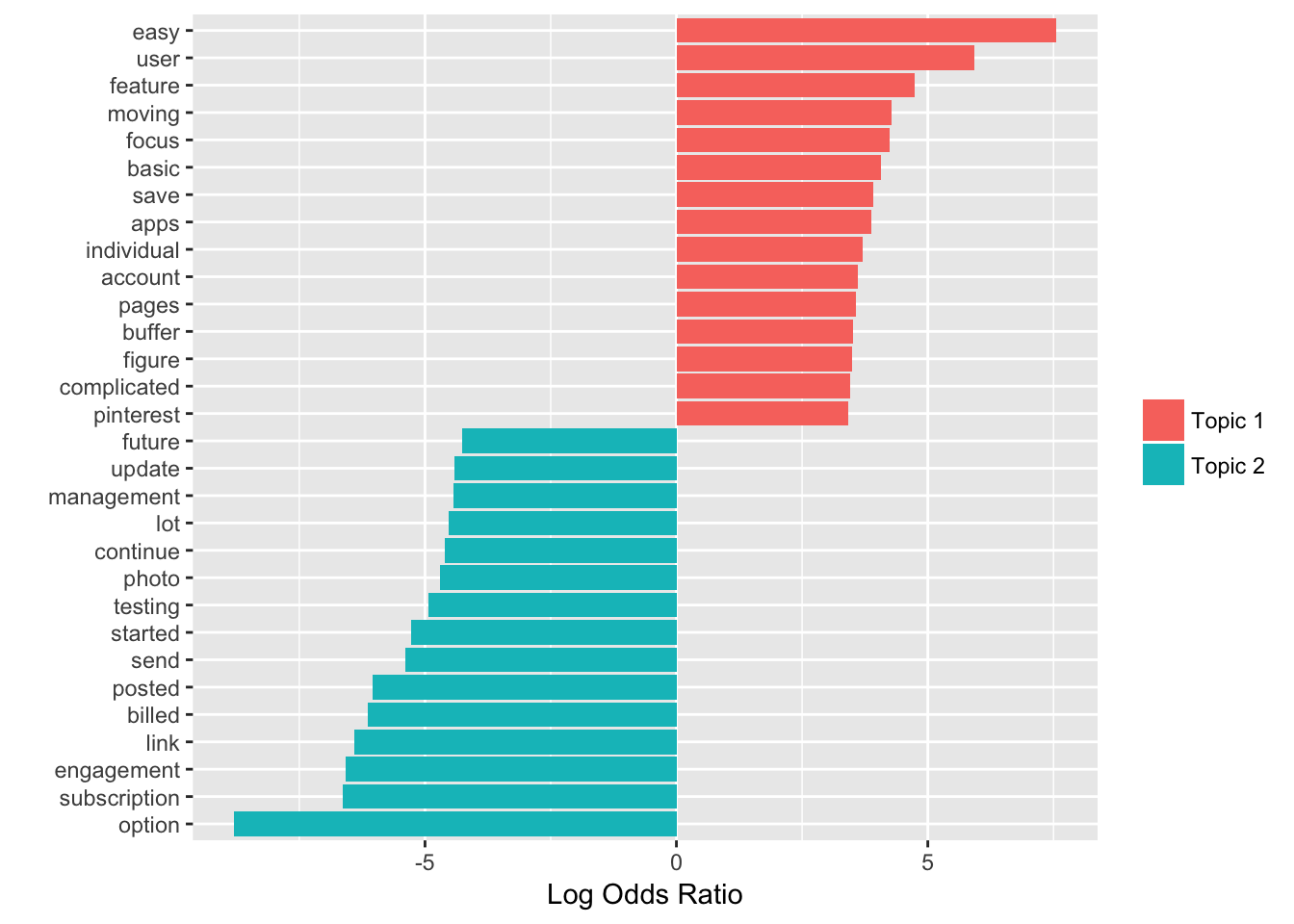
To be honest, I can’t quite figure out how these words relate to eachother and to a single topic. This method might not be the most useful to us in this particular case.
Conclusions
Based on the results of our anlaysis, it feels important to figure out why users stop using and needing Buffer. In many cases it could be due to external factors like business needs, market forces, layoffs, but in other cases it could be due to Buffer itself. Perhaps Buffer could have a better engagement loop. Or perhaps Buffer could help users that become inactive by suggesting content to share.
Another theme that appears repeatedly is cost. We know that the current pricing structure isn’t completely ideal, so it feels good to be working towards a more individualized structure over the next few product cycles.
There is a general theme of gratitude in these responses - “i love buffer” was a common phrase that appeared often in each survey. It’s comforting to know that people like the product and team – I hope that we’ll be able to use some of these learnings to give them a better experience. :)
# Unload lubridate package
detach("package:lubridate", unload=TRUE)