You’ve likely heard of activation rates before, especially if you’ve worked in a tech company. Facebook famously learned that users that connected with a certain number of friends were significantly more likely to be retained, so they encouraged users to connect with more friends when they signed up.
Causality in that relationship is questionable, but finding a testable hypothesis based on an observed relationship can be a big step forward for companies, especially those with the type of volume that Facebook had.
At Buffer, we have defined an activation metric that is related to the probability that a new user will be retained for a certain number of months. In this analysis, we will try to define an activation metric for Buffer for Business trials.
Defining an activation metric would allow us to experiment more rapidly, as the amount of time it takes to “activate” is inherently shorter than the length of a trial. Experiments that increase the activation rate of trialists should increase the conversion rate of the trial, if we have a good activation metric.
Data collection
We’ll begin by analyzing small number of features.
days_since_signup: The number of days between a user’s signup date and trial start date.plan_before_trial: The plan a user was on when he or she started the trial.team_members: The number of team members that the user had.updates: The number of updates scheduled in the first week of the trial.profiles: The number of profiles the user had in the first week of the trial.days_active: The number of days in which the user took any action in the first week of the trial.
We only look at data from the first week of the trial so that we can make predictions about the trial’s end result before it is completed.
We’ll avoid having to use a massive SQL query by using the data that has been collected in this handy look. We can use the get_look() function from the buffer package to pull the data into R.
# get data from look
trials <- get_look(4034)
We have around 25K trials to train our models on. Let’s do a bit of cleaning to get the data ready for analysis.
Data cleaning
First let’s rename the columns.
# rename columns
colnames(trials) <- c('user_id', 'plan_before_trial', 'join_date', 'trial_start', 'trial_end',
                      'converted', 'team_members', 'subscription_plan', 'updates', 'profiles', 'days_active')
Now we need to make sure that the columns in our data frame are of the correct type.
# create function to set date as date object
set_date <- function(column) {
  column <- as.Date(column, format = '%Y-%m-%d')
}

# apply function to date columns
trials[3:5] <- lapply(trials[3:5], set_date)
Now let’s replace NA values with 0.
# replace NA with 0
trials[is.na(trials)] <- 0
Ok, now we need to take a look at the plan_before_trial column. What are the values of this column?
# list frequencies of plan_before_trial values
table(trials$plan_before_trial)
We can simplify these values.
# list plan categories
awesome <- c('awesome', 'pro-monthly', 'pro-annual')
individual <- c(NULL, 'individual', '')

# set plan_before_trial as character type
trials$plan_before_trial <- as.character(trials$plan_before_trial)

# assign new values to plan_before_trial
trials <- trials %>%
  mutate(previous_plan = ifelse(plan_before_trial %in% awesome, 'awesome',
                                     ifelse(plan_before_trial %in% individual, 'individual', 'business')))

# set plans as factors
trials$previous_plan <- as.factor(trials$previous_plan)

# remove unneeded column
trials$plan_before_trial <- NULL
Cool! We’re just about ready to go. Let’s create a new variable days_to_trial that counts the number of days that elapsed between the users joining Buffer and starting a trial.
# create days_to_trial column
trials <- trials %>%
  mutate(days_to_trial = as.numeric(trial_start - join_date))
Alright! We are ready for some exploratory analysis! Let’s first save our dataset here. :)
Exploratory data analysis
We have several features to analyze in this dataset. It might be useful to visualize how they are related to one another, if at all. But first, let’s just take a look and see how many of our 28K trials converted.
# see how many trials converted
trials %>%
  group_by(converted) %>%
  summarise(users = n_distinct(user_id)) %>%
  mutate(percent = users / sum(users))
## # A tibble: 2 x 3
## converted users percent
## <fctr> <int> <dbl>
## 1 No 21624 0.8927421
## 2 Yes 2598 0.1072579Alright, around 10% of trials converted. That’s more than I thought! Now let’s plot our features and see how they are related.
# define features
features <- trials %>%
  select(team_members, updates, profiles, days_active, days_to_trial, previous_plan)

# plot the relationship
plot(features)
It’s difficult to glean much from this visualization. Let’s zoom in on a couple features that I suspect might be related. First, let’s see if profiles and updates might be related. We’ll take the log of updates to scale it down a bit.
# plot profiles and updates
trials %>%
  filter(profiles <= 50) %>%
  ggplot(aes(x = profiles, y = log(updates))) +
  geom_point(position = 'jitter', alpha = 0.2) +
  stat_smooth(method = 'loess')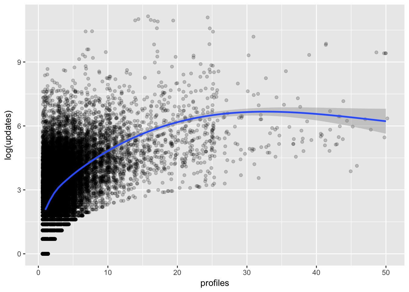
We can see that there is indeed a positive relationship that is stronger at lower profile counts. Let’s look at the relationship between updates and team_members now.
library(ggridges)

# plot team members and updates
ggplot(filter(trials, team_members <= 5), aes(x = log(updates), y = as.factor(team_members))) +
  geom_density_ridges(rel_min_height = 0.01, scale = 2) +
  theme_ridges() +
  labs(x = "Log Updates", y = "Team Members")
Cool! We can see that the distribution of the log of updates shifts to the right as the number of team members increases.
What do the distributions of updates look like for users that converted their trials?
# plot distributions of updates
ggplot(trials, aes(x = log(updates), y = converted, fill = converted)) +
  geom_density_ridges(rel_min_height = 0.01, scale = 2) +
  theme_ridges() +
  guides(fill=FALSE) +
  labs(x = "Log Updates", y = "Converted")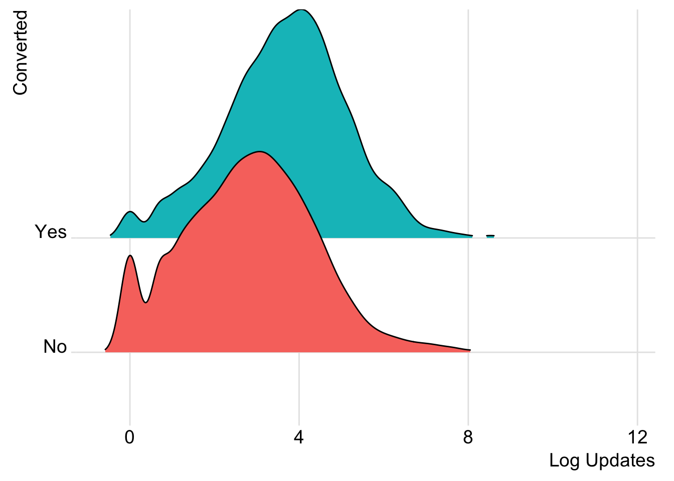
And what about profiles?
# plot distributions of profiles
trials %>%
  ggplot(aes(x = converted, y = profiles)) +
  geom_boxplot() +
  scale_y_continuous(limits = c(0, 20)) +
  theme_minimal() +
  labs(x = "Converted", y = NULL, title = "Number of Profiles")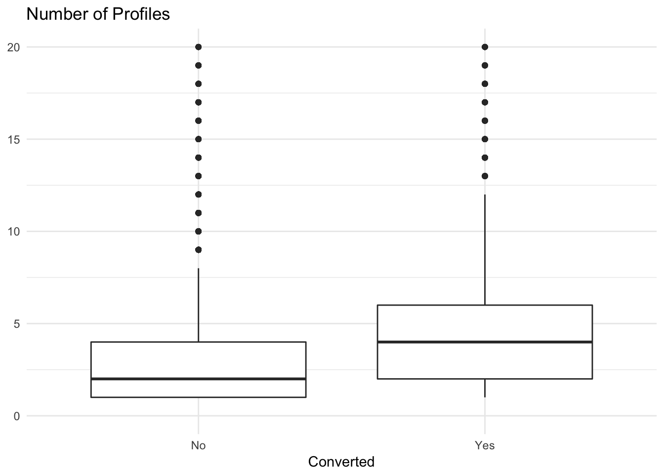
We can see that users that converted tended to have a higher number of profiles associated with their accounts. Alright, now let’s move forwards towards predictive modeling.
Choosing and evaluating models
This is a classification task, so we’ll want to think of measures like precision and recall. We’ll evaluate single-variable models, logistic regression, decision trees, and random forest models in this analysis. How should we evaluate these models?
The most common measure of quality is accuracy, which is the number of items categorized correctly divided by the total number of items. This might not be appropriate for this case though, because our classes (converted and unconverted are unbalanced).
We then move on to precision and recall. Precision represents how often a positive classification turns out to be correct. Recall is the fraction of things that are in the class that are detected by the classifier. There are combinations of the two, like F1 as well.
For our classifier, we will calculate the area under the ROC curve (which represents every possible tradeoff between sensitivity and specificity). We’ll call this area under the curve AUC.
Single variable models.
Let’s see how well each individual feature does in predicting trial conversions. First, we’ll need to split our data into training and testing sets.
# set seed for reproducibility
set.seed(1235)

# give a random number to each observation
trials$rgroup <- runif(nrow(trials))

# remove cases in which team members > 10
trials <- trials %>% filter(team_members <= 10)

# split observations into training and testing sets
training <- subset(trials, rgroup <= 0.8)
testing <- subset(trials, rgroup > 0.8)
Now let’s identify categorical and numeric features. Then, we’ll build a function to make single-variable models.
# list variables we don't want to include
to_exclude <- c('user_id', 'join_date', 'trial_start', 'trial_end', 'converted', 'rgroup')

# get a list of the features
vars <- setdiff(colnames(trials), to_exclude)

# odentify the categorical variables
catVars <- vars[sapply(trials[, vars], class) %in% c('factor', 'character')]

# identify the numeric variables
numVars <- vars[sapply(trials[, vars], class) %in% c('numeric', 'integer')]
Define the outcome.
# specify the outcome
outcome <- 'converted'

# specify which outcome is considered positive
pos <- "Yes"
Cool, now let’s define a function to make preditions based on the levels of the categorical variables.
# given a vector of training outcomes (outcomes), a categorical training variable (variable),
# and a prediction variable (predictor), use outcomes and variable to build a single-variable model
# and then apply the model to predictor to get new predictions.

make_prediction <- function(outcomes, variable, predictor) {

  # Find how often the outcome is positive during training
  positive_rate <- sum(outcomes == pos) / length(outcomes)

  # We need this to handle NA values
  na_table <- table(as.factor(outcomes[is.na(variable)]))

  # Get stats on how often outcome is positive for NA values in training
  positive_rate_na <- (na_table/sum(na_table))[pos]

  var_table <- table(as.factor(outcomes), variable)

  # Get stats on how often outcome is positive, conditioned on levels of the variable
  pPosWv <- (var_table[pos,] + 1.0e-3 * positive_rate)/(colSums(var_table) + 1.0e-3)

  # Make predictions by looking up levels of the predictor
  pred <- pPosWv[predictor]

  # Add in predictions for levels of the predictor that weren’t known during training
  pred[is.na(pred)] <- positive_rate

  pred

}
Apply this function.
for(v in catVars) {

  # Make prediction for each categorical variable
  pi <- paste('pred_', v, sep='')

  # Do it for the training and testing datasets
  training[, pi] <- make_prediction(training[, outcome], training[, v], training[, v])
  testing[, pi] <- make_prediction(testing[, outcome], testing[, v], testing[, v])
}
Once we have the predictions, we can find the categorical variables that have a good AUC both on the training data and on the calibration data not used during training. These are likely the more useful variables.
library(ROCR)

# define a function to calculate AUC
calcAUC <- function(predictions, outcomes) {

  perf <- performance(prediction(predictions, outcomes == pos), 'auc')
  as.numeric(perf@y.values)

}
Now, for each of the categorical variables, we calculate the AUC based on the predictions that we made earlier.
for(v in catVars) {

  pi <- paste('pred_', v, sep = '')

  aucTrain <- calcAUC(training[, pi], training[, outcome])
  aucTest <- calcAUC(testing[, pi], testing[, outcome])

  print(sprintf("%s, trainingAUC: %4.3f testingnAUC: %4.3f", pi, aucTrain, aucTest))

}
## [1] "pred_previous_plan, trainingAUC: 0.600 testingnAUC: 0.598"The AUC for the single-variable model using previous_plan as the predictor is around 0.60, which isn’t that much better than random guessing. Let’s use the same technique for numeric variables by converting them into categorical variables.
# define a function that makes predictions
make_prediction_numeric <- function(outcome, variable, predictor) {

  # make the cuts to bin the data
  cuts <- unique(as.numeric(quantile(variable, probs = seq(0, 1, 0.1), na.rm = T)))
  varC <- cut(variable, cuts)
  appC <- cut(predictor, cuts)

  # now apply the categorical make prediction function
  make_prediction(outcome, varC, appC)
}
Now let’s apply this function to the numeric variables.
# loop through the columns and apply the formula
for(v in numVars) {

  # name the prediction column
  pi <- paste('pred_', v, sep = '')

  # make the predictions
  training[, pi] <- make_prediction_numeric(training[, outcome], training[, v], training[, v])
  testing[, pi] <- make_prediction_numeric(training[, outcome], training[, v], testing[, v])

  # score the predictions
  aucTrain <- calcAUC(training[, pi], training[, outcome])
  aucTest <- calcAUC(testing[, pi], testing[, outcome])

  print(sprintf("%s, trainingAUC: %4.3f testingnAUC: %4.3f", pi, aucTrain, aucTest))

}
## [1] "pred_team_members, trainingAUC: 0.768 testingnAUC: 0.778"
## [1] "pred_updates, trainingAUC: 0.643 testingnAUC: 0.666"
## [1] "pred_profiles, trainingAUC: 0.671 testingnAUC: 0.676"
## [1] "pred_days_active, trainingAUC: 0.600 testingnAUC: 0.614"
## [1] "pred_days_to_trial, trainingAUC: 0.585 testingnAUC: 0.585"Alright. It looks like team members, updates, profiles, and days active could be good predictors of a trial conversion. We’ll try to beat an AUC of 0.65 with our models.
General linear model
Let’s fit a general linear model to our data and see how well if performs.
# fit glm
glm_mod <- glm(converted ~ team_members + updates + profiles + days_active + previous_plan + days_to_trial,
               data = training, family = 'binomial')
Let’s view a summary of the model.
# view summary of model
summary(glm_mod)
##
## Call:
## glm(formula = converted ~ team_members + updates + profiles +
## days_active + previous_plan + days_to_trial, family = "binomial",
## data = training)
##
## Deviance Residuals:
## Min 1Q Median 3Q Max
## -4.0747 -0.3860 -0.3170 -0.2716 2.5960
##
## Coefficients:
## Estimate Std. Error z value Pr(>|z|)
## (Intercept) -2.174e+00 8.747e-02 -24.857 <2e-16 ***
## team_members 9.299e-01 2.025e-02 45.925 <2e-16 ***
## updates -9.748e-06 1.741e-05 -0.560 0.5756
## profiles 5.131e-02 4.387e-03 11.695 <2e-16 ***
## days_active 1.330e-01 1.306e-02 10.183 <2e-16 ***
## previous_planbusiness -5.188e-01 2.899e-01 -1.790 0.0735 .
## previous_planindividual -1.344e+00 6.614e-02 -20.324 <2e-16 ***
## days_to_trial 1.181e-04 6.769e-05 1.745 0.0809 .
## ---
## Signif. codes: 0 '***' 0.001 '**' 0.01 '*' 0.05 '.' 0.1 ' ' 1
##
## (Dispersion parameter for binomial family taken to be 1)
##
## Null deviance: 15138 on 20032 degrees of freedom
## Residual deviance: 11012 on 20025 degrees of freedom
## AIC: 11028
##
## Number of Fisher Scoring iterations: 5Interestingly, team_members, profiles, days_active, previous_plan, and days_to_trial all have significant effects on the probability that a trial converts, but updates does not!
The point estimate for updates is even negative! This doesn’t quite seem right, so let’s take a closer look at this feature. I suspect that there is some overfitting going on.
# plot distribution of updates in training dataset
ggplot(training, aes(x = updates)) +
  stat_ecdf()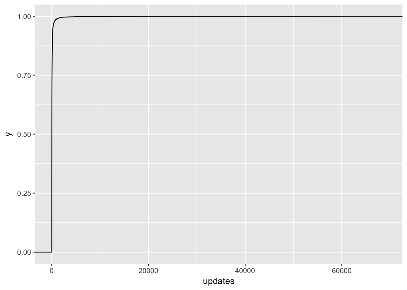
Ok, no wonder! There are people with over 70K updates scheduled in the first week! Let’s zoom in a bit.
# plot distribution of updates
ggplot(training, aes(x = updates)) +
  stat_ecdf() +
  coord_cartesian(xlim = c(0, 400)) +
  scale_y_continuous(breaks = seq(0, 1, 0.2))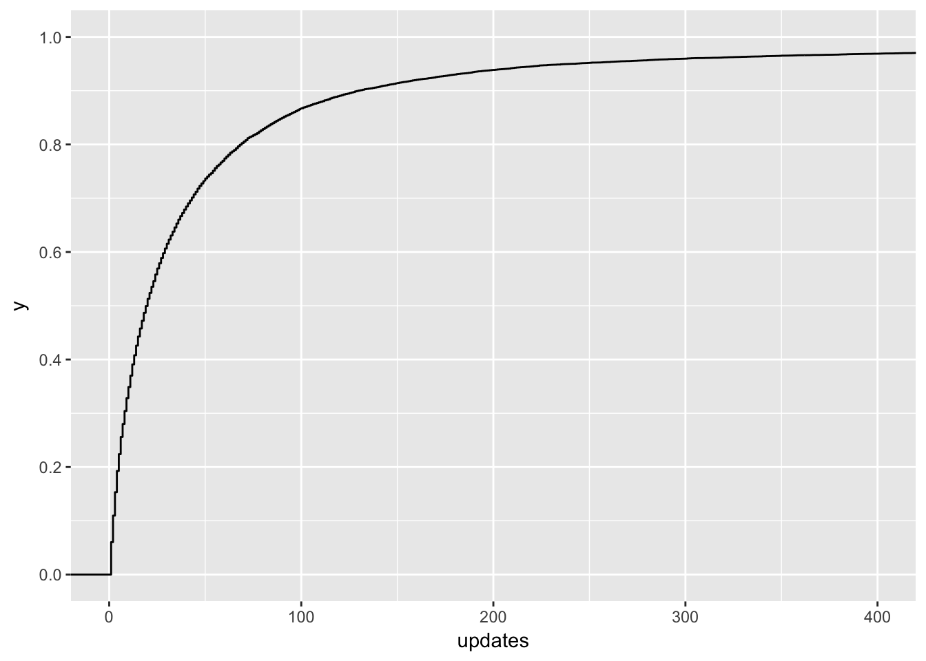
Around 95% of users in the training set scheduled 200 or less updates in the first week of the trial. Let’s filter users that scheduled more out of the dataset and revisit them later.
# remove people that scheduled 200 or more updates from the training dataset
training <- training %>%
  filter(updates < 200)
Ok, now let’s refit the general linear model.
# fit glm
glm_mod <- glm(converted ~ team_members + updates + profiles + days_active + previous_plan + days_to_trial,
               data = training, family = 'binomial')

# summarize model
summary(glm_mod)
##
## Call:
## glm(formula = converted ~ team_members + updates + profiles +
## days_active + previous_plan + days_to_trial, family = "binomial",
## data = training)
##
## Deviance Residuals:
## Min 1Q Median 3Q Max
## -3.9699 -0.3646 -0.3021 -0.2606 2.6465
##
## Coefficients:
## Estimate Std. Error z value Pr(>|z|)
## (Intercept) -2.435e+00 9.589e-02 -25.389 < 2e-16 ***
## team_members 9.468e-01 2.144e-02 44.166 < 2e-16 ***
## updates 2.588e-03 7.052e-04 3.670 0.000243 ***
## profiles 9.912e-02 7.429e-03 13.343 < 2e-16 ***
## days_active 1.025e-01 1.502e-02 6.823 8.91e-12 ***
## previous_planbusiness -8.176e-01 3.375e-01 -2.423 0.015400 *
## previous_planindividual -1.241e+00 7.273e-02 -17.061 < 2e-16 ***
## days_to_trial 3.306e-05 7.489e-05 0.442 0.658834
## ---
## Signif. codes: 0 '***' 0.001 '**' 0.01 '*' 0.05 '.' 0.1 ' ' 1
##
## (Dispersion parameter for binomial family taken to be 1)
##
## Null deviance: 13668.1 on 18798 degrees of freedom
## Residual deviance: 9750.5 on 18791 degrees of freedom
## AIC: 9766.5
##
## Number of Fisher Scoring iterations: 5That’s more like it! All features have statistically significant effects. Let’s make predictions on the testing set now. :)
# make predictions on testing set
testing$probs <- predict(glm_mod, newdata = testing, type = c("response"))

# create prediction object
pred <- prediction(testing$probs, testing$converted)

# plot ROC curve
roc = performance(pred, measure = "tpr", x.measure = "fpr")
plot(roc) + abline(a = 0, b = 1, lty = 2)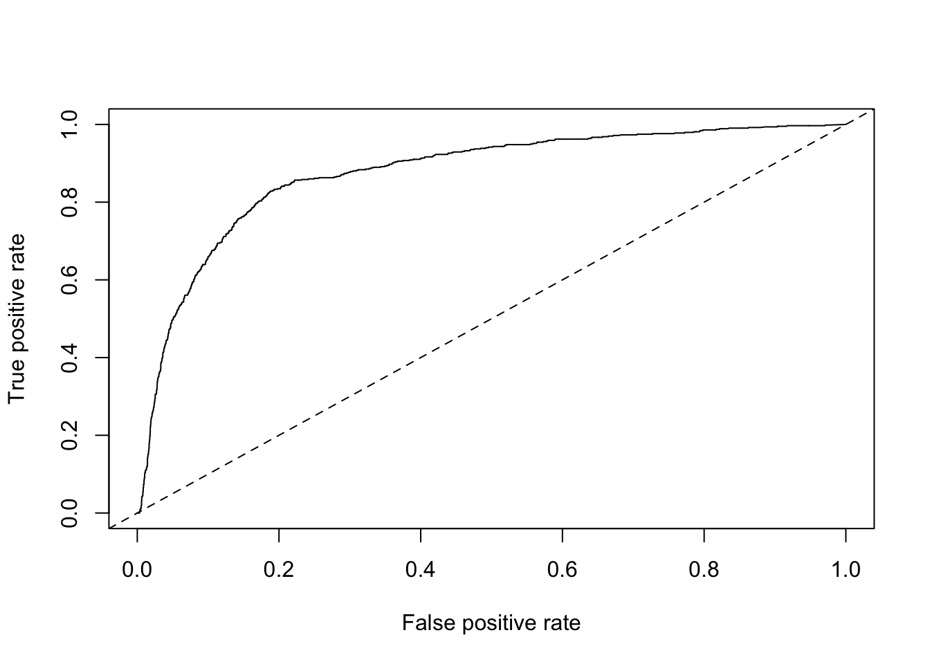
## integer(0)Sweet! Now let’s plot the accuracy of the model.
# plot accuracy
acc.perf = performance(pred, measure = "acc")
plot(acc.perf)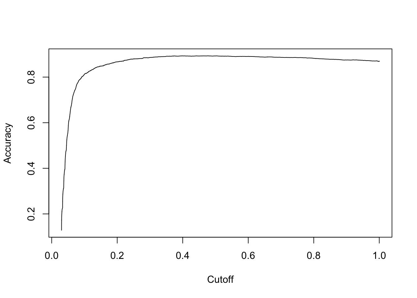
Now let’s calculate the AUC for the model.
# calculate AUC
performance(pred, measure = "auc")
## An object of class "performance"
## Slot "x.name":
## [1] "None"
##
## Slot "y.name":
## [1] "Area under the ROC curve"
##
## Slot "alpha.name":
## [1] "none"
##
## Slot "x.values":
## list()
##
## Slot "y.values":
## [[1]]
## [1] 0.8748636
##
##
## Slot "alpha.values":
## list()Alright, 0.86 is pretty dang good!
Using decision trees
Building decision trees involves proposing many possible data cuts and then choosing the best cuts based on simultaneous competing criteria of predictive power, cross-validation strength, and interaction with other chosen cuts.
One of the advantages of using a package for decision tree work is not having to worry about the construction details.
library(rpart); library(rpart.plot)

# fit decision tree model
tree_mod <- rpart(converted ~ team_members + updates + profiles + days_active + previous_plan + days_to_trial,
               data = training, method = 'class', control = rpart.control(cp = 0.001, minsplit = 1000,
                                                              minbucket = 1000, maxdepth = 5))

# plot model
rpart.plot(tree_mod)
Ok, so this tree model has one node. If a user has 2 or more team members, around 62% convert, compared to only 7% of those with 1 or less. Let’s see how well it does at predicting conversions in the testing set. I suspect not very well.
# make predictions on testing set
testing$tree_preds <- predict(tree_mod, newdata = testing)[,2]

# create prediction object for tree model
pred <- prediction(testing$tree_preds, testing$converted)

# plot ROC curve
roc = performance(pred, measure = "tpr", x.measure = "fpr")
plot(roc) + abline(a = 0, b = 1, lty = 2)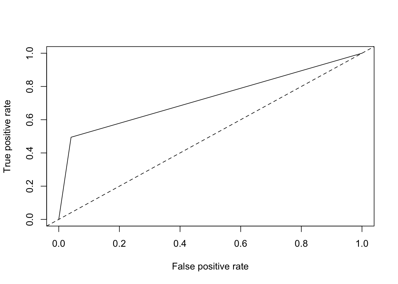
## integer(0)This model did not perform well. Let’s calculate the AUC just for kicks and giggles.
# calculate AUC
performance(pred, measure = "auc")
## An object of class "performance"
## Slot "x.name":
## [1] "None"
##
## Slot "y.name":
## [1] "Area under the ROC curve"
##
## Slot "alpha.name":
## [1] "none"
##
## Slot "x.values":
## list()
##
## Slot "y.values":
## [[1]]
## [1] 0.7269378
##
##
## Slot "alpha.values":
## list()It’s 0.69, about as good as single variable model, which is what it is!
Random forests
Random Forest is a versatile machine learning method capable of performing both regression and classification tasks. It also undertakes dimensional reduction methods, treats missing values, outlier values and other essential steps of data exploration, and does a fairly good job. It is a type of ensemble learning method, where a group of weak models combine to form a powerful model.
Let’s try it out.
library(randomForest)

# fit random forest model
rf_mod <- randomForest(converted ~ team_members + updates + profiles + days_active + previous_plan +
                         days_to_trial, data = training, importance = T, ntree = 500)
Let’s see which variables were important to the model.
# plot variable importance
varImpPlot(rf_mod)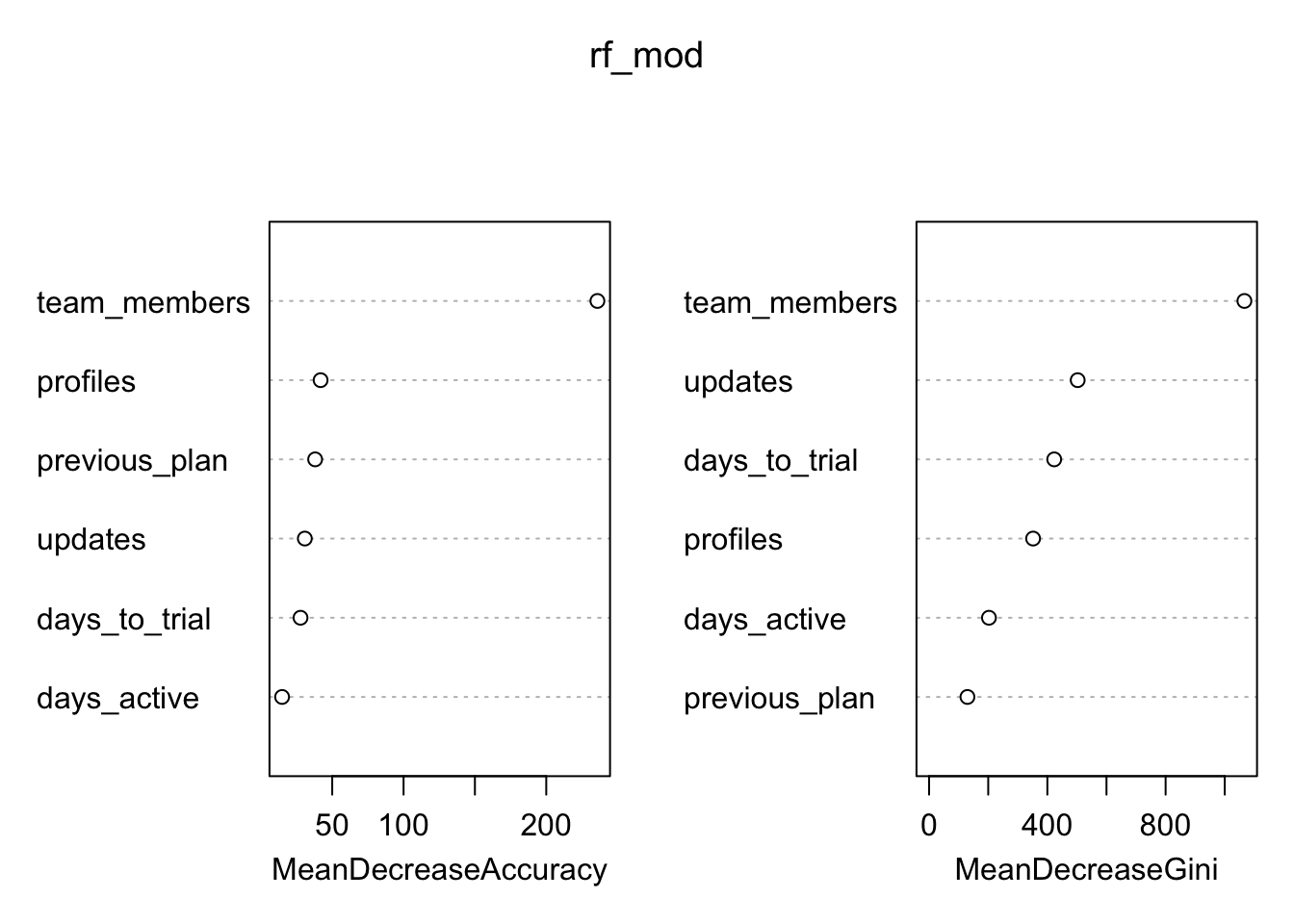
Since the random forest algorithm uses a large number of bootstrap samples, each data point x has a corresponding set of out-of-bag samples: those samples that don’t contain the point x. The out-of-bag samples can be used is a way similar to N-fold cross validation, to estimate the accuracy of each tree in the ensemble.
To estimate the imporance of a variable, the variable’s values are randomly permuted in the out-of-bag samples, and the corresponding decrease in each tree’s accuracy is estimated. If the average decrease over all the trees is large, then the variable is considered important – its value makes a big difference in predicting the outcome. If the average decrease is small, then the variable doesn’t make much difference to the outcome. The algorithm also measures the decrease in node purity that occurs from splitting on a permuted variable (how this variable affects the quality of the tree).
Those team members! Let’s make our predictions on the testing set.
# make predictions based on random forest model
rf_preds <- predict(rf_mod, newdata = testing, type = 'prob')

# create prediction object for rf model
rf_pred <- prediction(rf_preds[, 2], testing$converted)

# plot ROC curve
roc = performance(rf_pred, measure = "tpr", x.measure = "fpr")
plot(roc) + abline(a = 0, b = 1, lty = 2)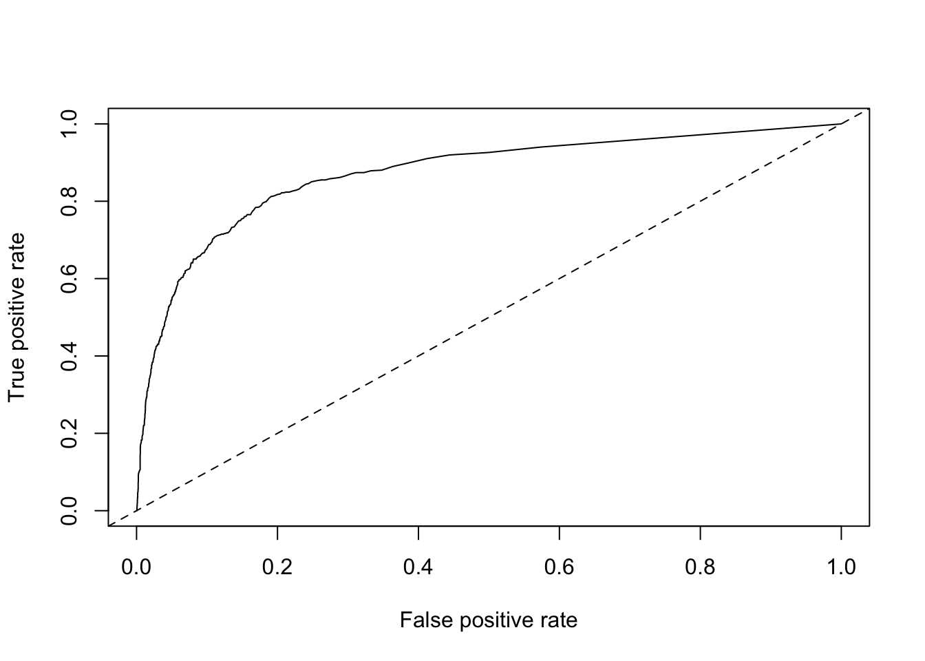
## integer(0)Now let’s calculate AUC.
# calculate AUC
performance(rf_pred, measure = "auc")
## An object of class "performance"
## Slot "x.name":
## [1] "None"
##
## Slot "y.name":
## [1] "Area under the ROC curve"
##
## Slot "alpha.name":
## [1] "none"
##
## Slot "x.values":
## list()
##
## Slot "y.values":
## [[1]]
## [1] 0.8716769
##
##
## Slot "alpha.values":
## list()Alright, we have 0.86. This is much better than the single-variable models and the decision tree model, but performed about the same as the general linear model! Now that we’ve tried a few different approaches, let’s get back to the original goal of defining an activation metric for Business trialists.
An activation metric
We’ve built these models. How does that help us find an activation metric? We know that our features (team members, updates, etc) are important, so we can do some more exploratory analysis to see how we could fit them into an activation metric.
We’ll start with team_members. That seems to be the most important variable in each of our models. Let’s plot team members against the proportion of trials that converted.
# plot team members and conversion rate
trials %>%
  group_by(team_members, converted) %>%
  summarise(users = n_distinct(user_id)) %>%
  mutate(percent = users / sum(users)) %>%
  filter(converted == 'Yes') %>%
  ggplot(aes(x = as.factor(team_members), y = percent)) +
  geom_bar(stat = 'identity') +
  labs(x = "Number of Team Members", y = NULL, title = "Conversion Rate by Team Size")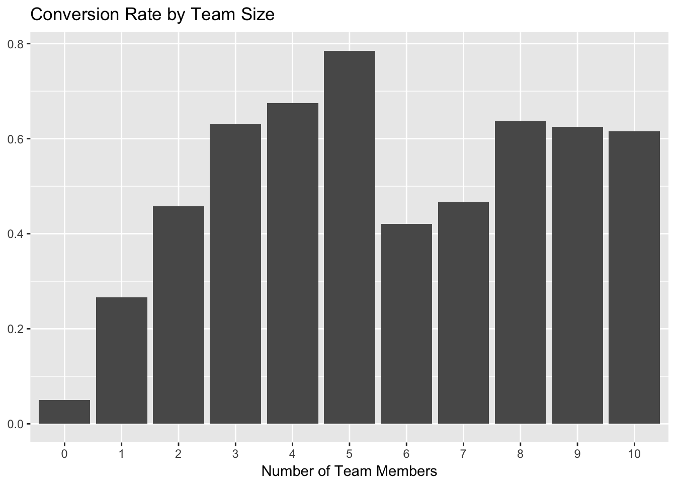
As we can see, the conversion rate increases quite a bit for trialists with the addition of each team member, up to 5. The biggest jump comes from 0 to 2 team members, so we can start by using at least one team member as part of the activation metric.
The number of updates scheduled in the first week was also an important feature, so let’s make the same plot for that. We’ll need to bucket the number of updates to convert the continuous variable into a categorical one.
# make the cuts to bin the updates data
cuts <- unique(as.numeric(quantile(trials$updates, probs = seq(0, 1, 0.1), na.rm = T)))

# set updates bins
trials$update_bin <- cut(trials$updates, cuts)

# plot updates bin and conversion rate
trials %>%
  filter(!(is.na(trials$update_bin))) %>%
  group_by(update_bin, converted) %>%
  summarise(users = n_distinct(user_id)) %>%
  mutate(percent = users / sum(users)) %>%
  filter(converted == 'Yes') %>%
  ggplot(aes(x = as.factor(update_bin), y = percent)) +
  geom_bar(stat = 'identity') +
  labs(x = "Number of Updates", y = NULL, title = "Conversion Rate by Updates Shared")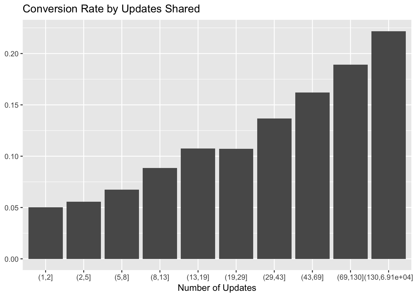
There looks to be a near-linear relationship between update bin and conversion rate. We can use 10 or more updates as a good cutoff for our activation metric, so as to not cut off too many trialists.
Now let’s look at profiles.
# make the cuts to bin the profiles data
cuts <- unique(as.numeric(quantile(trials$profiles, probs = seq(0, 1, 0.1), na.rm = T)))

# set profile bins
trials$profile_bin <- cut(trials$profiles, cuts)

trials %>%
  filter(!(is.na(trials$profile_bin))) %>%
  group_by(profile_bin, converted) %>%
  summarise(users = n_distinct(user_id)) %>%
  mutate(percent = users / sum(users)) %>%
  filter(converted == 'Yes') %>%
  ggplot(aes(x = as.factor(profile_bin), y = percent)) +
  geom_bar(stat = 'identity') +
  labs(x = "Number of Profiles", y = NULL, title = "Conversion Rate by Profiles")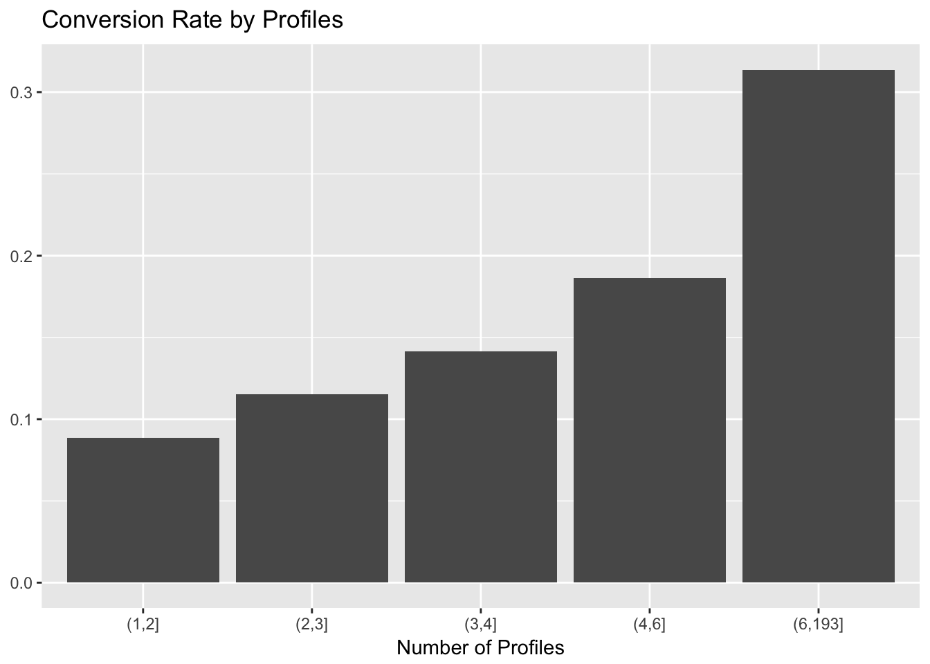
There seems to be a large relative jump at the 4 profile mark. I acknowledge that this is not good science, but let’s go with it.
Finally we can look at the number of days active in the first week of the trial.
# plot conversion rate and days active
trials %>%
  filter(!(is.na(trials$days_active))) %>%
  group_by(days_active, converted) %>%
  summarise(users = n_distinct(user_id)) %>%
  mutate(percent = users / sum(users)) %>%
  filter(converted == 'Yes') %>%
  ggplot(aes(x = as.factor(days_active), y = percent)) +
  geom_bar(stat = 'identity') +
  labs(x = "Number of Days Active", y = NULL, title = "Conversion Rate by Days Active")
Cool. I’m hesitent to include this, but let’s see what happens for different activation metric choices. What would happen if we chose the following criteria for an “activation”:
- At least 1 team member.
- At least 4 profiles.
- At least 10 updates.
# define a boolean activation variable
trials <- trials %>%
  mutate(activated = (team_members >= 1 & profiles >= 4 & updates >= 10))

# find conversion rate for those activated
trials %>%
  group_by(activated, converted) %>%
  summarise(users = n_distinct(user_id)) %>%
  mutate(percent = users / sum(users))
## # A tibble: 4 x 4
## # Groups: activated [2]
## activated converted users percent
## <lgl> <fctr> <int> <dbl>
## 1 FALSE No 21022 0.92201754
## 2 FALSE Yes 1778 0.07798246
## 3 TRUE No 596 0.41131815
## 4 TRUE Yes 853 0.58868185Alright. With these criteria, around 6% of trials activated. Around 59% of activated trials converted, compared to only 8% of trials that did not activate.
Conclusions
Add conclusions and assumptions here.
Activation metric can be 1 team member, 10 updates, and 4 profiles through the first week.