Tech companies are often asked about their retention curves. Growth hacking and marketing techniques can provide new users, but product/market fit and retention loops will keep them using your product.
I realized that I don’t have a solid grasp of Buffer’s retention curve, so I thought I’d make a small post out of the exploration.
Picking the right metrics to use to calculate retention can be a tricky thing. It should be a leading indicator of revenue and repeat behavior. It shouldn’t be a vanity metric like app downloads. For Buffer, the major retention metric we’ll use is scheduling a post.
Next we’ll need to choose the right period for each cohort of users. For Buffer, a weekly or monthly period would make sense. For simplicity’s sake, we’ll begin with a monthly period.
Once we make our overall retention curve, we can segment it by different user characteristics.
Let’s begin gathering the data we need.
Data collection
For each user that has scheduled an update, we’ll want to collect all of the months in which the user scheduled at least one update. We will also need the user’s signup date.
select
  u.user_id
  , date_trunc('month', u.created_at) as join_month
  , date_trunc('month', up.created_at) as month
  , count(distinct up.id) as updates
from users as u
left join profiles as p
  on u.user_id = p.user_id
left join dbt.updates as up
  on u.user_id = up.user_id
where up.was_sent_with_buffer = TRUE
  and u.created_at >= '2016-01-01'
  and u.created_at <= up.created_at
group by 1, 2, 3
We now have almost 3 million rows of data to work with.
Data tidying
We need to specify the first month that a user shared an update, and then we need to specify which month (1st, 2nd, etc.) each update month represents for each user.
# specify first update month
first_month <- users %>%
  group_by(user_id) %>%
  summarise(first_update_month = min(month))

# join first month into original data frame
users <- users %>%
  inner_join(first_month, by = 'user_id')

# remove unneeded dataframe
rm(first_month)
Now let’s calculate the differences in months.
# function to calculate difference in months
elapsed_months <- function(end_date, start_date) {

    end <- as.POSIXlt(end_date)
    start <- as.POSIXlt(start_date)
    12 * (end$year - start$year) + (end$mon - start$mon)

}

# calculate differences in months
users <- users %>%
  mutate(month_num = elapsed_months(month, first_update_month) + 1)
Building the retention curve
For each month number, we want to see the percentage of users that could have scheduled an update that did schedule an update. Let’s start with users that scheduled their first update in January of 2016.
# filter users
jan_users <- users %>% filter(first_update_month == '2016-01-01')

# build retention curve
jan_users %>%
  group_by(month_num) %>%
  summarise(users = n_distinct(user_id)) %>%
  mutate(percent = users / max(users)) %>%
  ggplot(aes(x = month_num, y = percent)) +
  geom_point() +
  geom_line() +
  scale_x_continuous(breaks = seq(0, 18, 3)) +
  scale_y_continuous(breaks = seq(0, 1, 0.2)) +
  labs(x = "Month", y = NULL, title = "Retention Curve for Users (Jan 2016)") +
  theme_minimal()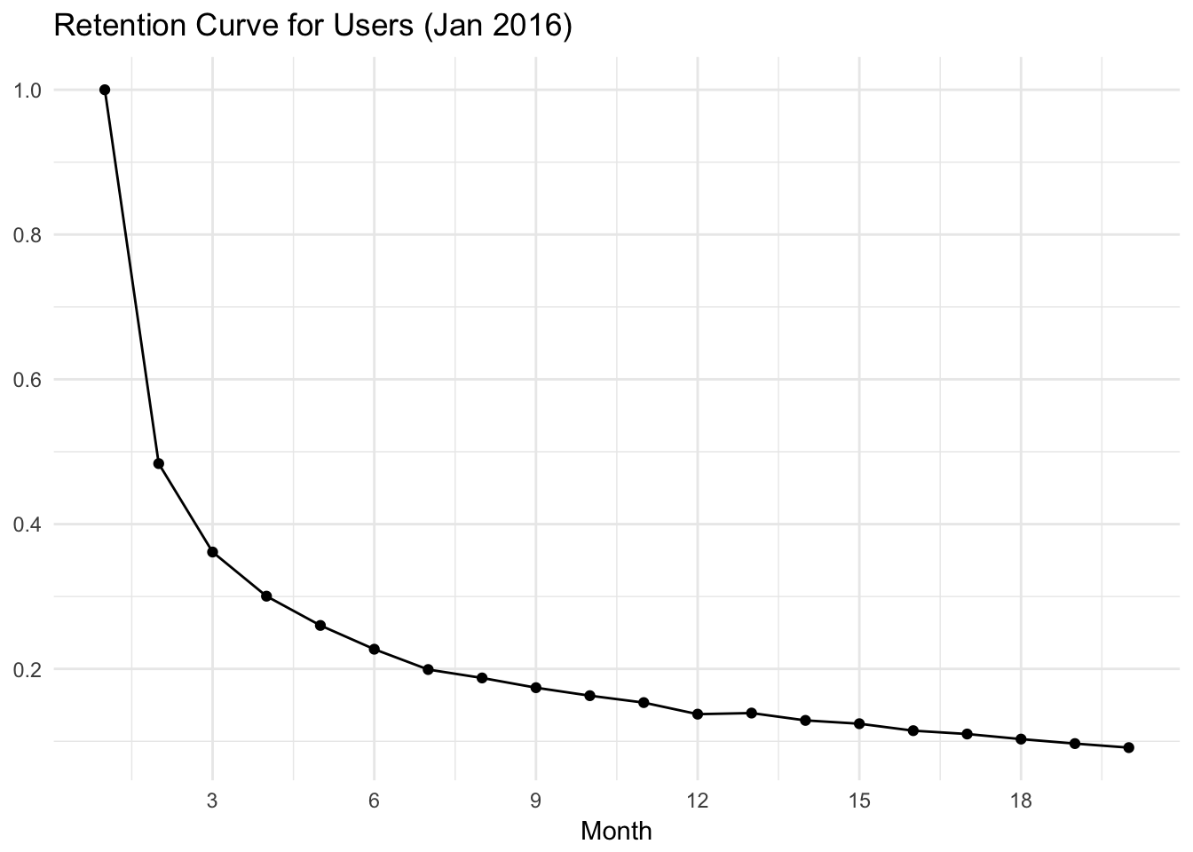
Great! Now, let’s try to build the overall retention curve. The challenge is that we want to make sure we’re only taking the percentage of users that could have sent an update that did. We’ll therefore only look at users that have been around for 12 months.

The graph above shows us the percentage of users that scheduled an update with Buffer on each month after scheduling their first update. Approximately 46% of users schedule an update in the month following the month in which they scheduled their first update. Around 32% of users scheduled an update in month 3, around 21% of users scheduled an update in month 6, and around 15% of users scheduled an update in month 12. This seems pretty good!
This data was taken with one big sample. We can also look at how the monthly retention rates have changed over time.

This is interesting! Overall, it looks like retention has been declining since the beginning of 2016. Retention rates for months 2, 3, 6, and 12 have all declined since 2016. I won’t speculate on the cause of these trends here, but it is something to address!
We can also attemt to create a plot similar to the one in this Y Combinator blog post.


This graph also indicates that retention is trending in the wrong direction! We would hope for the more recent cohorts to have retention curves that are higher than previous cohorts’ retention curves.
That’s all for now. Thanks for reading. Please let me know of any questions about the methodology, graphs, or anything!