In this analysis we will look at how MRR has grown in 2017. We will look at the overall growth of MRR as measured by our daily MRR calculation, and we will look at the MRR components (new, churn, etc.) as measured by the Stripe MRR breakdown script.
We will try to determine if there are any long term trends in the MRR we gain and lose each week to determine if net mrr, defined as MRR gained less MRR lost in any given time period, is trending towards 0.
We will also run simulations based on historical MRR growth to predict what the MRR growth rate will be given certain conditions.
We will aggregate MRR growth, and the growth of the components that make up MRR, by week. I chose this because it is a standard unit of time. It will help us compare time windows of the same length, which we cannot do with months. Months also have differing numbers of weekdays in them, which impacts MRR growth.
Net MRR by MRR calculation
Let’s start by looking at how Stripe MRR has grown each week this year, as measured by the daily MRR calculation.
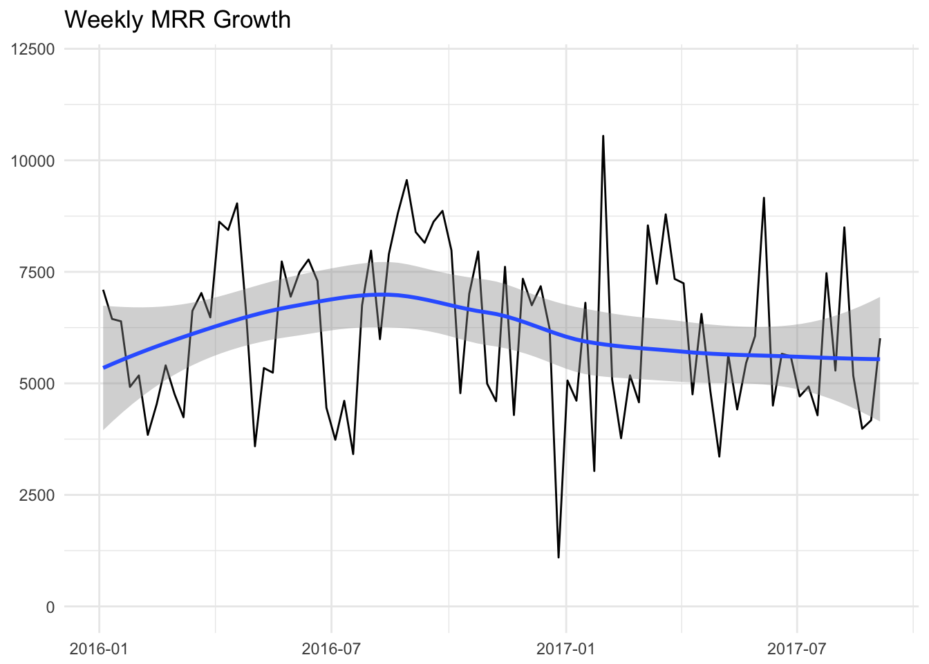
The data suggests that 2016 was a bit more volatile than 2017 has been so far. We experimented with trial length and pricing, which caused some volatility. Overall the amount of MRR growth from Stripe each week seems relatively stable. There may be a slight negative trend over the past several weeks however.
Let’s look at the MRR breakdown data.
Revenue gained and lost
Now we can look at the weekly MRR amounts that were gained and lost since January 2016. These amounts were calculated with the new Stripe MRR breakdown script.

It looks like there may be an issue with the data on the last week of June, let’s remove it. We can stil learn from this data. Let’s add new and upgrade together to get net gained, and churn and downgrade to get net lost.

We can flip the sign on net MRR lost to more easily compare the lines.
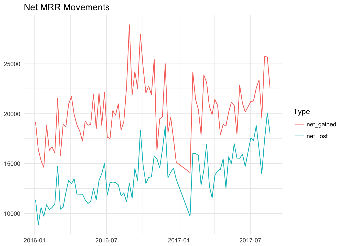
We can see in this graph that net_lost has increased over time, but so has net_gained. There is always a gap between the two, but it isn’t easy to tell if the gap is growing, shrinking, or staying about the same.

We can find out by looking at the overall net MRR amount, which is equal to new + upgrade - churn - downgrade MRR.

At first glance, it does appear that there may be a slight decrease in weekly new MRR in 2017 compared to 2016. There is a lot of variance here, so we can try to fit a smoother over this data to view longer term trands. The big spike and dip in July 2016 was arount the tie we were experimenting with trial lengths.
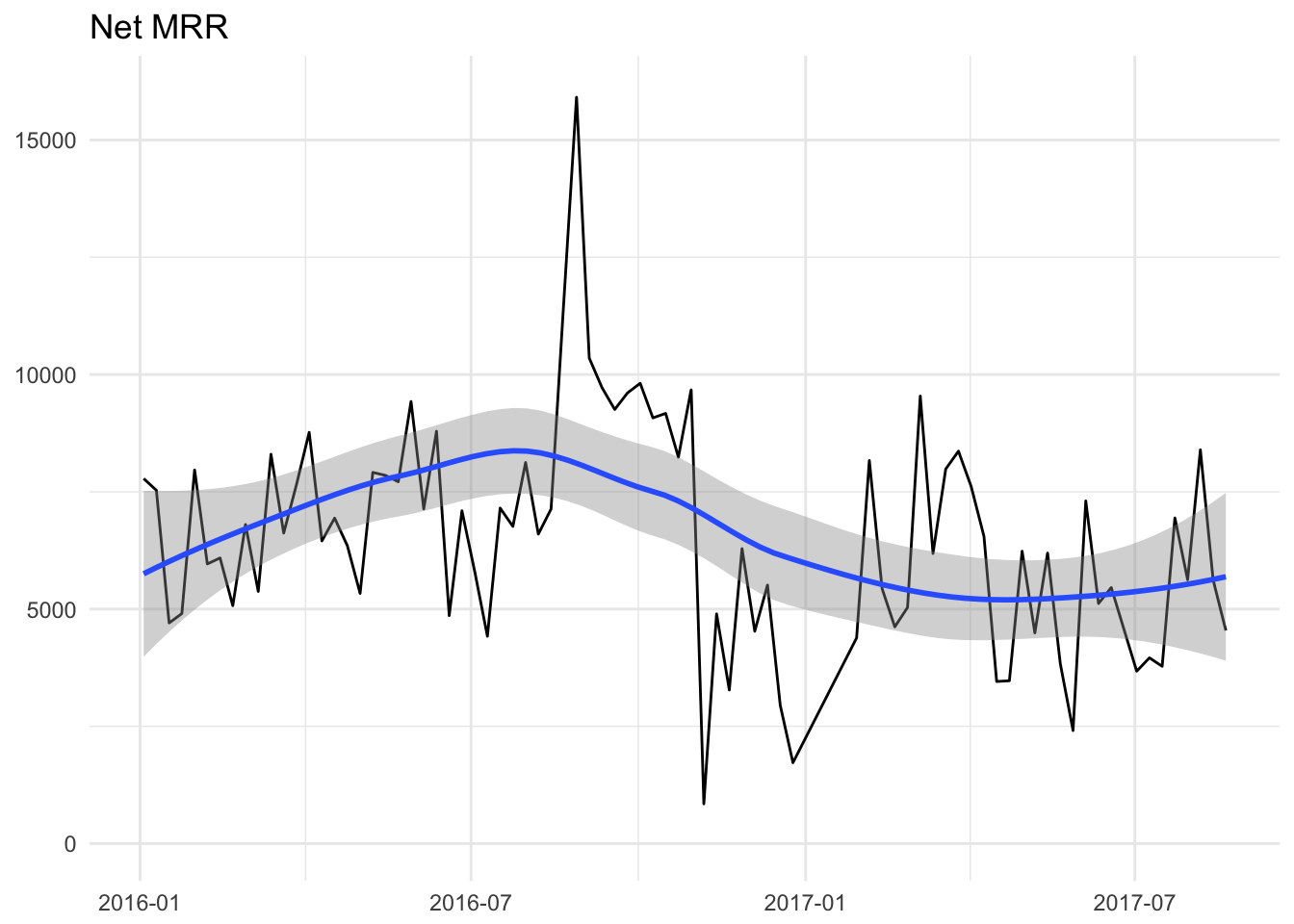
In the past 20 months, the data suggests that there may have been a slight decrease in MRR gained in 2017 compared to 2016. This effect appears after the end of April 2017, but it doesn’t seem like the trend continues to decrease after that.
This is how net MRR would look if we only looked at data from 2017.

It is worth remembering that net MRR is the combination of new, churn, upgrade, and downgrade MRR.
Extrapolating a bad scenario
We’ve seen that there may have been a slight dip in weekly net mrr in 2017. We can go through the exercise of thinking about the worst-case scenario if the trend continues.
In the very first graph of this analysis, in which I show the amount that Stripe MRR has changed each week in the past two years, we can fit a straight line through the data by fitting a linear regression model.

We can see that this line has a negative slope, which isn’t ideal. We can extrapolate it into the future and determine how long it might take for this line, which represents the average weekly growth rate, to reach 0.
# get linear equation
lm_mod <- lm(change ~ week, data = mrr)
summary(lm_mod)
##
## Call:
## lm(formula = change ~ week, data = mrr)
##
## Residuals:
## Min 1Q Median 3Q Max
## -4981.2 -1400.0 -78.1 1377.4 4510.8
##
## Coefficients:
## Estimate Std. Error t value Pr(>|t|)
## (Intercept) 26737.721 18410.135 1.452 0.150
## week -1.204 1.076 -1.119 0.266
##
## Residual standard error: 1795 on 86 degrees of freedom
## Multiple R-squared: 0.01435, Adjusted R-squared: 0.002885
## F-statistic: 1.252 on 1 and 86 DF, p-value: 0.2663The formula for this line is change = beta + (-1.204 * week), which means that, on average, MRR change decreases by 1-2 dollars each week. At this rate it would take over one thousand weeks for this line to reach 0.
It’s worth noting that the effect of week on MRR change is not significant, meaning that there is not a significant negative effect on MRR, according to this linear regression model. There is a very weak correlation between time and MRR change in this model.
Simulating possible outcomes
Instead of this approach, we can use the variance in MRR change to simulate how the future could play out in thousands of parrallel universes. We can generate a random MRR growth number that is based on the average MRR growth in the past two years and the variance in that number. We can repeat that proccess hundredds of times to give us an idea of how things could play out under current conditions.
Let’s calculate the average amount that MRR grows weekly over the pats couple of years.
ggplot(mrr, aes(x = change)) +
  geom_histogram(color = 'white', binwidth = 500) +
  labs(x = "Weekly MRR Growth")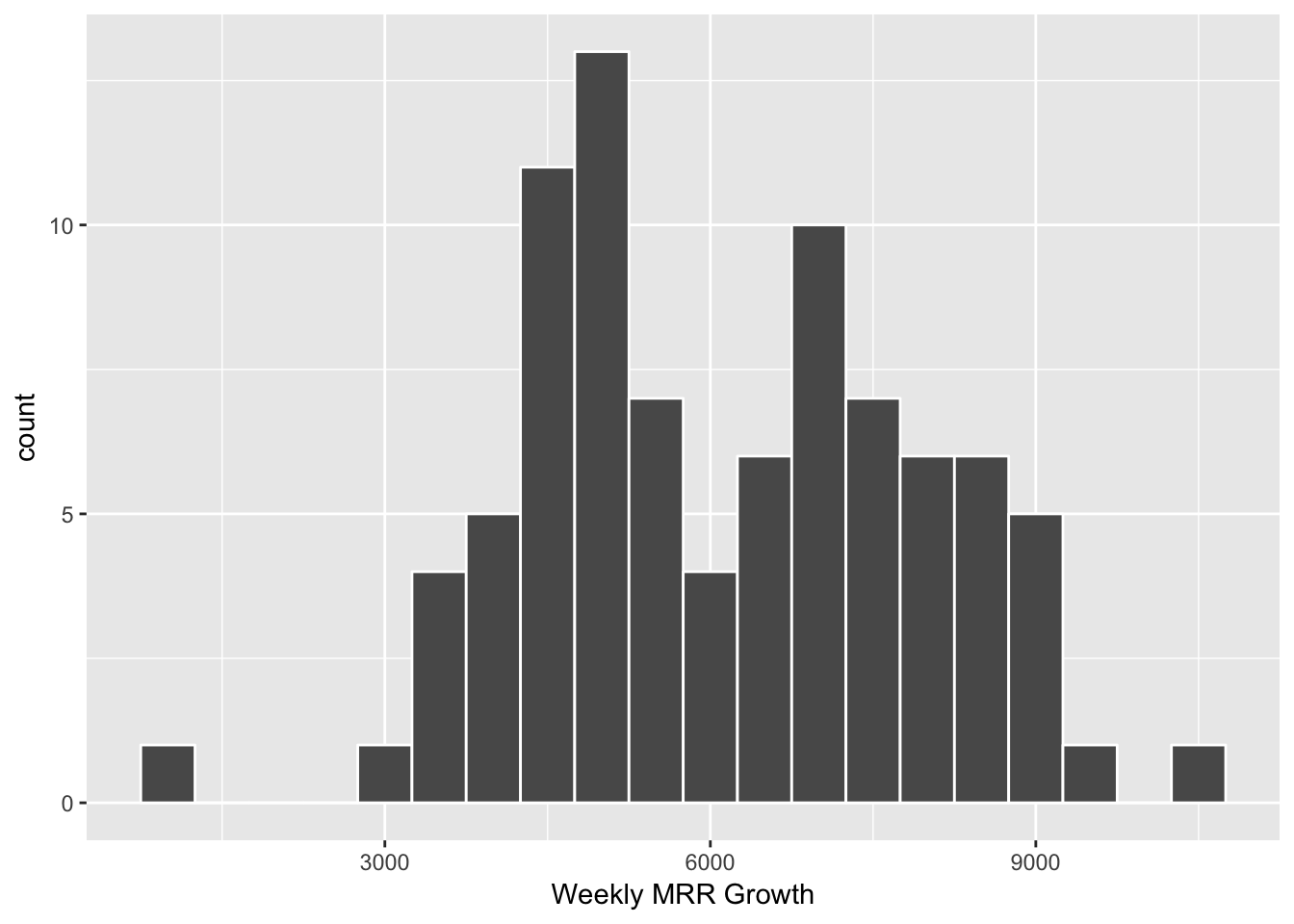
# find mean mrr growth
mean(mrr$change, na.rm = TRUE)
## [1] 6141.64We can also calculate the standard deviation.
# get the standard deviation
sd(mrr$change, na.rm = TRUE)
## [1] 1797.431We can now generate random samples from the distribution of MRR change. The assumes that weekly MRR change is normally distributed around 6141 with a standard deviation of 1797. Here are 10 of such numbers.
# generate random sample of 10 months of mrr growth.
rnorm(10, mean = mean(mrr$change, na.rm = T), sd = sd(mrr$change, na.rm = T))
## [1] 6009.839 5317.865 8378.095 5608.473 5168.732 4211.273 7262.153
## [8] 8614.697 5898.895 7850.217Now let’s get a sample of 52, simulating MRR growth for the next year, and repeat this 100 times.

Each line represents a different simulation based on our historical data. This is what it would look like to plot the average of all 100 simulations for each week.
ggplot() +
  geom_line(aes(x = week, y = samp, color = run), alpha = 0.2, data = runs) +
  geom_line(aes(x = week, y = mean_samp), data = by_week) +
  guides(color = FALSE) +
  theme_minimal() +
  labs(x = NULL, y = NULL, title = "Weekly MRR Change Simulations")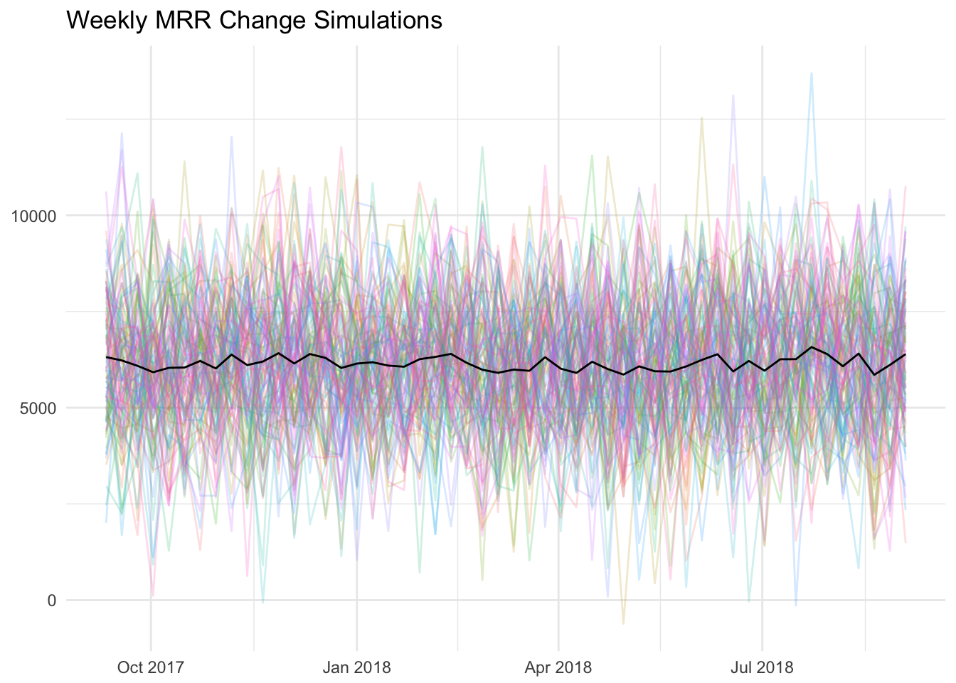
The first plot looked to be trending downwards to me, but the average is linear.
Monthly growth rate
I understand that the monthly growth rate is the metric that is given the most attention, so we can look at how that has changed over time as well. It might just be good to remember that a month is not quite a standard unit of time, because months have different numbers of days (and weekdays) in them. :)
These graphs shows a very linear relationship between month and MRR, with little variation. We can fit a linear regression model to get the equation for this line.
# get linear equation
lm_mod <- lm(mrr ~ month, data = monthly)
summary(lm_mod)
##
## Call:
## lm(formula = mrr ~ month, data = monthly)
##
## Residuals:
## Min 1Q Median 3Q Max
## -16416 -7656 -102 6233 34609
##
## Coefficients:
## Estimate Std. Error t value Pr(>|t|)
## (Intercept) -1.390e+07 1.860e+05 -74.73 <2e-16 ***
## month 8.705e+02 1.092e+01 79.70 <2e-16 ***
## ---
## Signif. codes: 0 '***' 0.001 '**' 0.01 '*' 0.05 '.' 0.1 ' ' 1
##
## Residual standard error: 11270 on 22 degrees of freedom
## Multiple R-squared: 0.9965, Adjusted R-squared: 0.9964
## F-statistic: 6352 on 1 and 22 DF, p-value: < 2.2e-16Now we can get predictions for future months.
The blue points are the predictions from the linear model. What would the MRR growth rate look like?
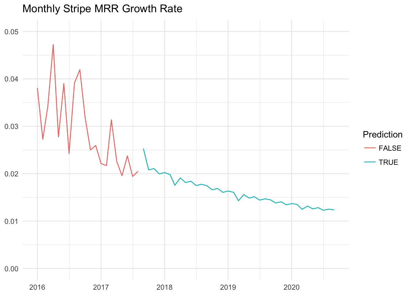
We can see that the monthly MRR growth rate would trend downwards, which we’d expect. The predictions assume linear growth, which we have experienced over the long run. There will be some significant variation however, as we can see with the growth rates in red. September 2017, for example, looks set to have a monthly growth rate around 1%, which is much lower than what this model would predict.
Conclusions
Overall, MRR growth appears to be steady but may have a slight downwward trend. This trend is not yet significant, and would take years to reach 0% growth. MRR gained through new signups and updates continues to increase, but so does MRR lost through churn and downgrades.
September 2017 looks set to be a month in which we experience lower-than-expected growth, which could slightly alter some of these estimations. I would guess that MRR would revert to the average, linear growth path over the next couple of months, but I can’t say that definitively.