I often get questions like “How many profiles do Business customers have?” or “How often to Business cusotmers log in?”. These are useful questions to ask when designing and developing a product to fit the needs of a specific user segment, but a singular answer isn’t always sufficient.
You could answer these questions with a mean or median, but these can be misleading if the metric in question isn’t normally distributed. You could respond with density plots and CDFs and communicate characteristics of the distributions, but I’ve found that it’s slightly difficult to comminicate what these plots mean (CDFs in particular).
Another approach you could take is clustering users based on a given set of features. For Buffer, these features could be the number of profiles a user has, the number of team members a user has, and the median number of posts shared per week. This approach can be more intuitive to people that don’t regularly work with data, and fits well with the idea of different user personas.
There are many clustering techniques, most of which are not too computer intensive. These have proven immensely useful in helping analysts discern patterns in datasets with multiple features. We’ll go over three in this analysis: k-means clustering, hierarchical clustering, and partitioning around medoids (PAM).
K-means Clustering
One of the oldest methods of cluster analysis is known as k-means cluster analysis. The first step (and certainly not a trivial one) when using k-means cluster analysis is to specify the number of clusters (k) that will be formed in the final solution.
The process begins by choosing k observations to serve as centers for the clusters. Then, the distance from each of the other observations is calculated for each of the k clusters, and observations are put in the cluster to which they are the closest. After each observation has been put in a cluster, the center of the clusters is recalculated, and every observation is checked to see if it might be closer to a different cluster, now that the centers have been recalculated. The process continues until no observations switch clusters.

K-means clustering is usually very fast, as you don’t need to calculate the distances between each data point and every other data point. A downside is that you are likely to get different results each time you reorder the data. The structure of a 3-cluster solution can be lost if you choose k = 4.
Partitioning around Medoids (PAM)
The R cluster library provides a modern alternative to k-means clustering, known as pam. The term “medoid” refers to an observation within a cluster for which the sum of the distances between it and all the other members of the cluster is a minimum.
pam requires that you know the number of clusters that you want (like k-means clustering), but it does more computation than k-means in order to insure that the medoids it finds are truly representative of the observations within a given cluster.
With pam, the sums of the distances between objects within a cluster are constantly recalculated as observations move around, which will hopefully provide a more reliable solution. Furthermore, as a by-product of the clustering operation it identifies the observations that represent the medoids, and these observations (one per cluster) can be considered a representative example of the members of that cluster which may be useful in some situations. As with k-means, there’s no guarantee that the structure that’s revealed with a small number of clusters will be retained when you increase the number of clusters.
Hierarchial Clustering
Hierarchical agglomerative clustering methods, starts out by putting each observation into its own separate cluster. It then examines all the distances between all the observations and pairs together the two closest ones to form a new cluster. This is a simple operation, since hierarchical methods require a distance matrix, and it represents exactly what we want - the distances between individual observations.
There are different methods to form the new clusters, and we’ll use one that tries to minimize the distance between the observations in a single cluster.
Alright, let’s get on with clustering business customers.
Data collection
We’ll use the buffer package to query Redshift for every customer on the business_v2_small_monthly plan, the number of profiles they have, the number of team members they have, and the number of successful charges they have made. For simplicity’s sake, we’ll cluster Business customers only by the number of profiles and team members they have. In the future we can include many more features to cluster by.
select
  s.customer as customer_id
  , u.user_id
  , count(distinct i.id) as paid_invoices
  , count(distinct p.id) as profiles
from stripe._subscriptions as s
inner join users as u
  on s.customer = u.billing_stripe_id
left join stripe._invoices as i
  on s.id = i.subscription_id
left join dbt.profiles as p
  on p.user_id = u.user_id
where s.plan_id = 'business_v2_small_monthly'
  and i.paid
  and (p.is_deleted = false or p.is_deleted is null)
  and (p.is_disabled = false or p.is_disabled is null)
group by 1, 2
The team members and organizations data is a little complex, so we’ll import it from Looker, where it is already modeled.
# get team member data
team_members <- get_look(4196)

# rename columns
colnames(team_members) <- c('user_id', 'team_members')

# set user_id as character
team_members$user_id <- as.character(team_members$user_id)
Now we can join the customers and team_members dataframes into a new one called users.
# join customers and team members
users <- customers %>%
  left_join(team_members, by = 'user_id')
The units of measurement are not the same for each variable, so we may want to scale the data. We want the unit of change in each coordinate to represent the same degree of difference.
# get the variables to user
features <- users %>%
  select(profiles, team_members)

# get the scaled matrix
p_matrix <- scale(features)

# get the mean values of the columns
p_center <- attr(p_matrix, "scaled:center")

# get the standard deviations
p_scale <- attr(p_matrix, "scaled:scale")
Hierarchical clustering
Now we can try the hclust method.
# create distance matrix
d <- dist(p_matrix, method = "euclidean")

# do the clustering
pfit <- hclust(d, method = "ward.D")
Now we can plot the dendrogram with a given number of clusters. We’ll start out with 3. This is just an arbitrary guess made by looking at the dendrogram, but we will explore methods for choosing the number of clusters later on.
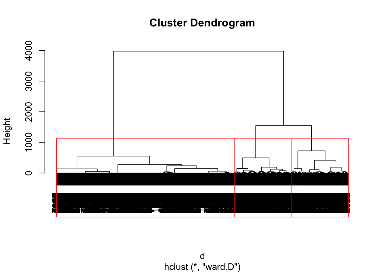
We can use the cutree() function to extract the specific numbers from each cluster and assign them to our users dataset.
# get group numbers
users$group <- as.factor(cutree(pfit, k = 3))
Now we can plot the number of profiles and team members for users in each cluster.
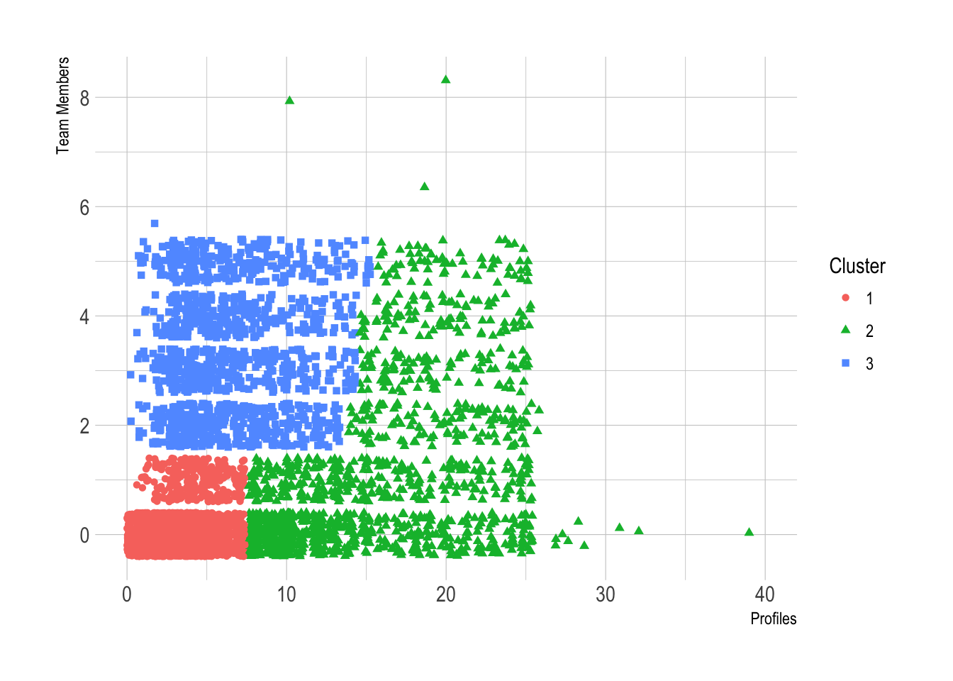
We can make a few quick observations from this scatterplot.
The first cluster has a low number of profiles (7 or less) and 0 or 1 team member.
The second cluster has 2 or more team members and 15 or less profiles.
The third cluster has more profiles (from 8 to 25) and a uniformly distributed number of team members.
This all begs the question of whether whether a given cluster represents actual structure in the data or is an artifact of the clustering algorithm. There are often clusters that represent structure in the data mixed with one or two clusters that represent the “other” data that doesn’t fit into any of the clusters. Clusters of “other” tend to be made up of data points that have no relationship to each other.
We eyeballed the appropriate k in this case from the dendrogram, but this isn’t always feasible with a large dataset. Can we pick a plausible k in a more automated fashion?
Finding the number of clusters K
There are a number of heuristics and rules-of-thumb for picking clusters; a given heu- ristic will work better on some datasets than others.
Total within sum of squares One simple heuristic is to compute the total within sum of squares (WSS) for different values of k and look for an elbow in the curve. If we define the cluster’s centroid as the point that is the mean value of all the points in the cluster, the within sum of squares for a single cluster is the average squared distance of each point in the cluster from the cluster’s centroid. The total within sum of squares is the sum of the within sum of squares of all the clusters.
The total WSS will decrease as the number of clusters increases, because each cluster will be smaller and tighter. The hope is that the rate at which the WSS decreases will slow down for k beyond the optimal number of clusters.
Calinski-Harabasz index The Calinski-Harabasz index of a clustering is the ratio of the between-cluster variance (which is essentially the variance of all the cluster centroids from the dataset’s grand centroid) to the total within-cluster variance (basically, the average WSS of the clusters in the clustering).
For a given dataset, the total sum of squares (TSS) is the squared distance of all the data points from the dataset’s centroid. The TSS is independent of the clustering.
If WSS(k) is the total WSS of a clustering with k clusters, then the between sum of squares BSS(k) of the clustering is given by BSS(k) = TSS - WSS(k). WSS(k) measures how close the points in a cluster are to each other. BSS(k) measures how far apart the clusters are from each other. A good clustering has a small WSS(k) and a large BSS(k).
The within-cluster variance W is given by WSS(k) / (n-k), where n is the number of points in the dataset. The between-cluster variance B is given by BSS(k) / (k-1). The within-cluster variance will decrease as k increases; the rate of decrease should slow down past the optimal k. The between-cluster variance will increase as k, but the rate of increase should slow down past the optimal k. So in theory, the ratio of B to W should be maximized at the optimal k.
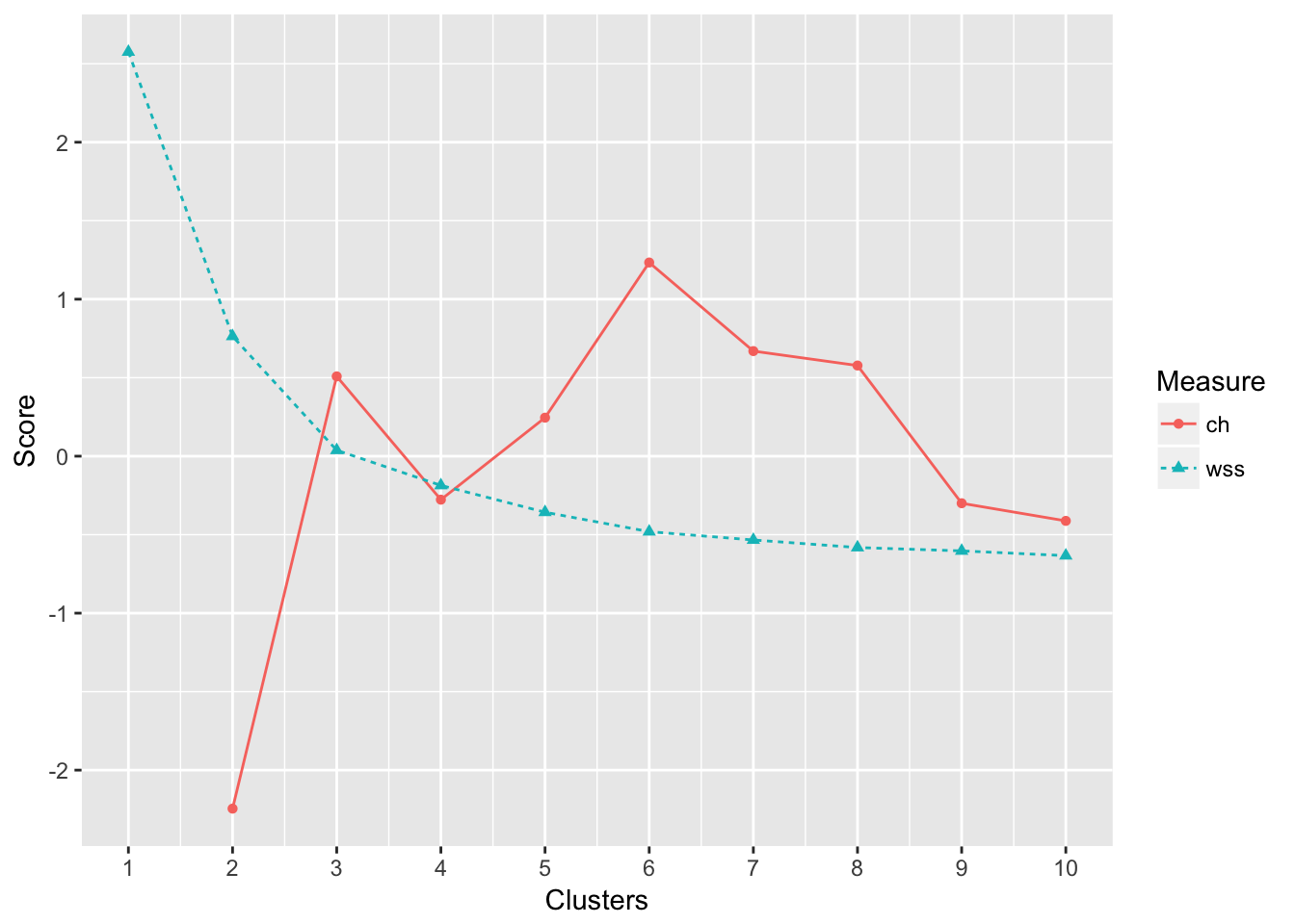
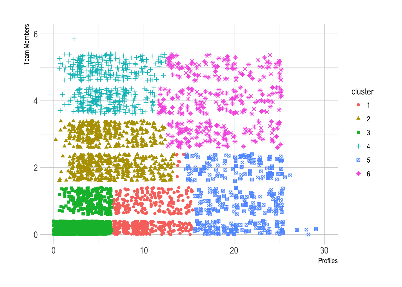
It looks like the local maximum occrs at k = 6 for the CH critereon. The WSS plot may have an elbow there at k = 3. Let’s run the kmeans algorithm with k = 6 and examine the clusters.
K-means clustering
We’ll run the algorithms with k = 4, 100 random starts, and 100 maximum iterations per run.
# cluster data
clusters <- kmeans(p_matrix, centers = 6, nstart = 100, iter.max = 100)

# view the centers of the clusters
clusters$centers
## profiles team_members
## 1 0.663729659 -0.4091606
## 2 -0.005778623 1.0077817
## 3 -0.556415477 -0.5601243
## 4 -0.058085908 2.3532484
## 5 2.492129136 -0.0643209
## 6 2.014109272 1.9931782Notice that these are scaled values that are not the original coordinates. It is still helpful to see the relative values for the groups. Let’s see how many users are in each group. Generally, a good clustering will be well-balanced.
# get group size
clusters$size
## [1] 811 769 4195 520 446 357It looks like the third cluster has a huge number of users, but that isn’t necessarily a bad thing. We can assign each user in the original dataset to a cluster and make some exploratory plots.
# assign clusters to users
users$cluster <- as.factor(clusters$cluster)

# plot team members and profiles
ggplot(users, aes(x = profiles, y = team_members, color = cluster)) +
  geom_point(aes(shape = cluster), position = "jitter") +
  theme_ipsum() +
  scale_x_continuous(limits = c(0, 30)) +
  scale_y_continuous(limits = c(0, 6)) +
  labs(x = "Profiles", y = "Team Members")