In September 2016 the growth team conducted an experiment on the price of Awesome plans. Approximately half of new users that signed up for Buffer were exposed to a variation of Buffer in which the price of the pro-monthly plan was raised from ten dollars to twenty dollars. The price of the pro-annual plan was raised from 102 dollars to 204 dollars.
Increasing the prices of the pro-monthly and pro-annual plans failed to increase the amount of revenue generated by customers that subscribed to the plans. The distribution of average revenue per user was not significantly different for each experiment group. There was more variation at the tail of the distribution (where the revenue values were greatest).
The control group had more users contribute higher levels of revenue, and I might hypothesize that this is because of the relative prices of the annual plans.
Data collection
We’ll use the buffer package to import the data in this Look into R. This data includes the user ID, created date, total captured charge amount, total refunded charge amount, and experiment group for each user that was a part of this experiment.
# collect data from look
users <- get_look(4170)
We have around 33 thousand users in this dataset. Let’s do a bit of cleaning to get the data ready for analysis.
# rename columns
colnames(users) <- c('user_id', 'added_date', 'group', 'created_at_date',
                     'captured_charge_amount', 'refunded_charge_amount')

# set dates as date
users$added_date <- NULL
users$created_at_date <- as.Date(users$created_at_date, format = '%Y-%m-%d')
Great, now we’re able to do a bit of exploratory analysis.
Exploratory
Let’s begin by calculating a couple of summary statistics for each experiment group.
# compute summary stats
users %>%
  group_by(group) %>%
  summarise(users = n_distinct(user_id),
            min_created_date = min(created_at_date),
            max_created_date = max(created_at_date),
            captured_charge_amount = sum(captured_charge_amount),
            refunded_charge_amount = sum(refunded_charge_amount)) %>%
  mutate(arpu = captured_charge_amount / users)
## # A tibble: 2 x 7
## group users min_created_date max_created_date captured_charge_amount
## <fctr> <int> <date> <date> <dbl>
## 1 control 16520 2016-09-16 2016-10-10 57946.06
## 2 enabled 16938 2016-09-16 2016-10-13 47001.05
## # ... with 2 more variables: refunded_charge_amount <dbl>, arpu <dbl>There were around 16.5K users in the control group and 16.9K users in the treatment group. Around 58K in Stripe charges were captured from the control group, while only around 47K was captured from the treatment group. This equates to an average revenue per user (ARPU) of around 3.5 for the control group and 2.8 for the treatment group.
If we plotted the distribution of ARPU for each experiment group, we would likely see curves similar to that of a power law distribution, in which most users have 0 and there is a long, heavy tail. Let’s see for ourselves.
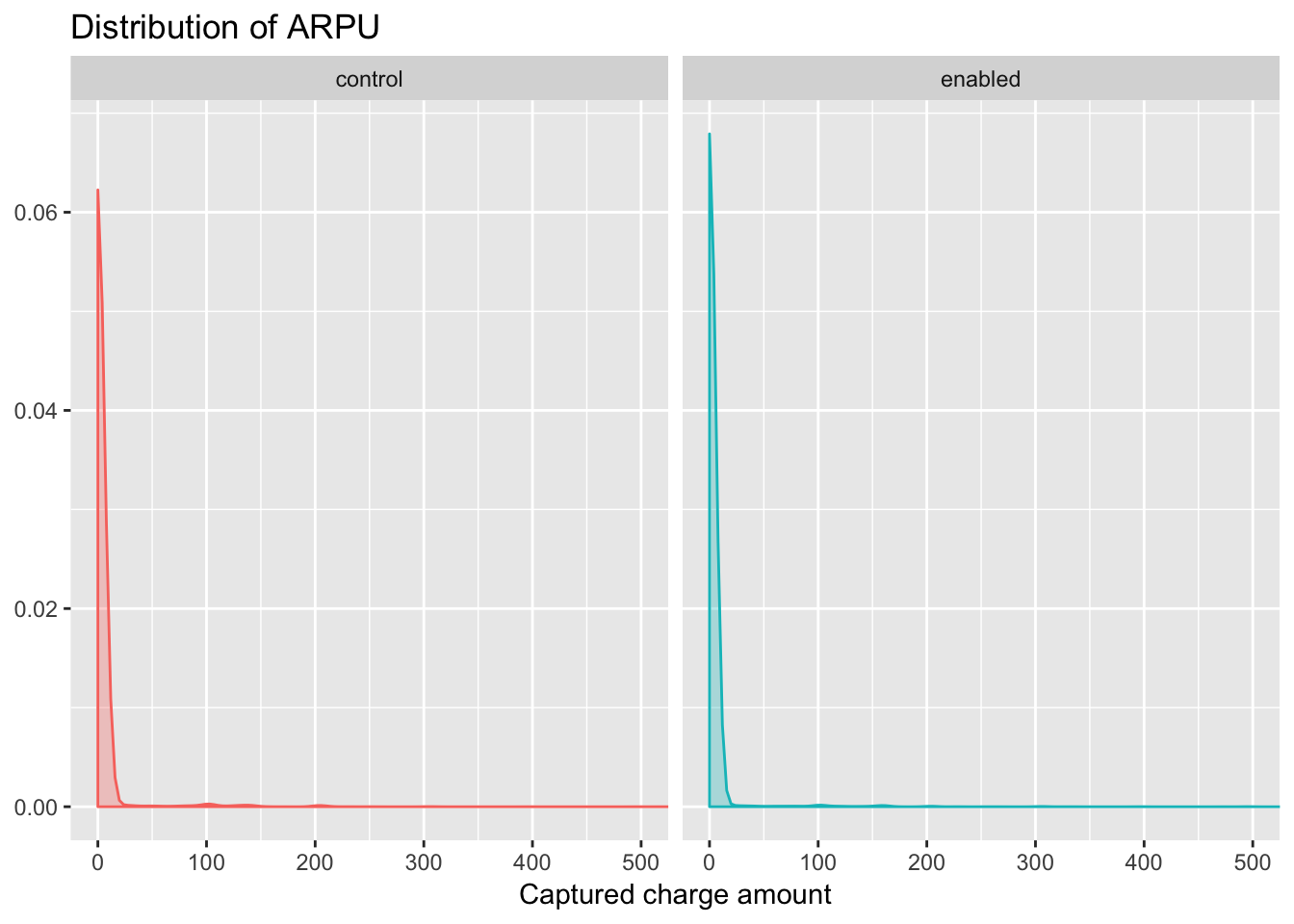
Yes, very power law-y. We can notice that the percentage of users in the enabled group with a value of 0 is slightly higher than that of those users in the control group.
Another way to compare two densities is with a quantile-quantile plot. In this type of plot, the quantiles of two samples are calculated at a variety of points in the range of 0 to 1, and then are plotted against each other. If the two samples came from the same distribution with the same parameters, we’d see a straight line through the origin with a slope of 1; in other words, we’re testing to see if various quantiles of the data are identical in the two samples.
If the two samples came from similar distributions, but their parameters were different, we’d still see a straight line, but not through the origin. For this reason, it’s very common to draw a straight line through the origin with a slope of 1 on plots like this. We can produce a quantile-quantile plot (or QQ plot as they are commonly known), using the qqplot function.
# isolate control and enabled values
control <- filter(users, group == 'control')$captured_charge_amount
enabled <- filter(users, group == 'enabled')$captured_charge_amount

qqplot(control, enabled)
abline(0,1)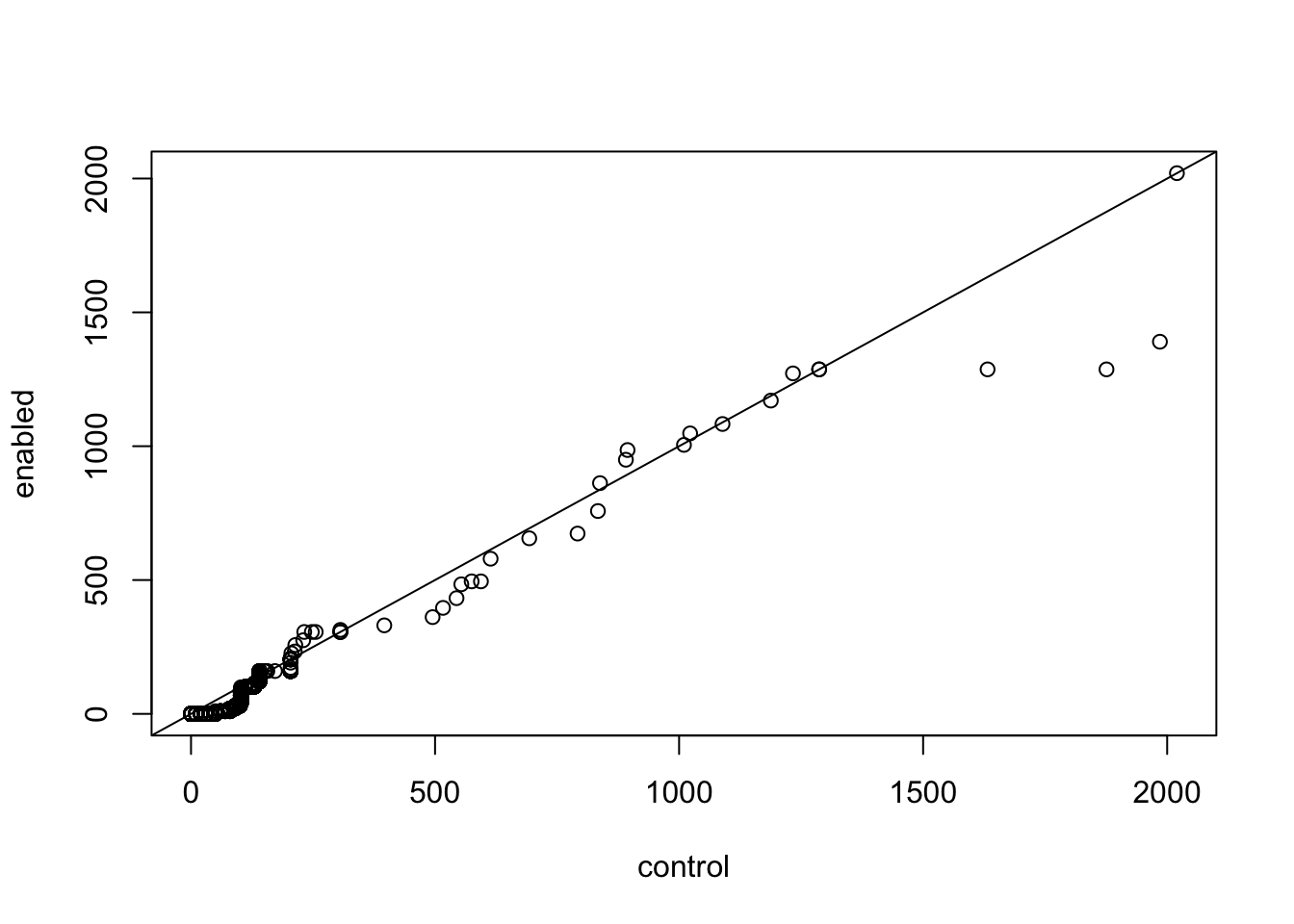
We can see that most of the points are located in the bottom-left corner of the graph. This is because the distribution is more power-law than normal (most of the users have an ARPU close to 0). The points in the middle of the graph seems to agree fairly well, but there are some discrepancies near the tail (the extreme values at the end of the distribution). The tails of a distribution are the most difficult part to accurately measure, which is unfortunate, since those are often the values that interest us most.
We can see that a few of these points at the extreme are higher for the control group than they are for the experiment group (they are below the line). These points might have a big influence on the outcome of the hypothesis test. Maybe there are users that subscribed to high-value plans.
Because the tails of a distribution are so important, another way to test to see if a distribution of a sample follows the distribution of another sample is to calculate the quantiles of some tail probabilities (using the quantile function) and compare them to the theoretical probabilities from the distribution. Here is that comparison for the control group and the enabled group.
# tail probabilities
probs = c(.9, .95, .99)
# compute quantiles for control group
quantile(control, probs)## 90% 95% 99%
## 0 0 102# compute quantiles for enabled group
quantile(enabled, probs)## 90% 95% 99%
## 0 0 80The only difference is the 99% quantile. For the control group, approximately 1% of users have an ARPU of 102 or above. The 99% quantile is only 80 dollars for the enabled group.
This feels like an important discovery. The $102 amount is the cost of the annual plan. I would hypothesize that the annual plan’s attraction decreased by more for users in the enabled group because its absolute price was $102 higher than the original price. This is a larger absolute difference than the change from $10 to $20.
In a future experiment, I would love to experiment with only changing the price of the monthly Awesome plan, and leaving the price of the annual plan at $102, or even decreasing it to $99. This would make the annual plan much more attractive. We would need to be careful about measuring the lifetime value of customers in this case, and keep close track of customer retention. A conversation for another day!
Hypothesis testing
The original hypothesis of this experiment was that, by increasing the price of the Awesome plans, we could increase overall revenue generated by customers of these plans. We felt that the increase in value of the features available in the plans, specifically the content library, as well as the price points for Edgar (49 dollars) and Business plans (99 dollars), justified the price increase.
We can clearly see that the price change failed to increase revenue generated from these users, but, had the enabled group generated more revenue than the control, we would have to use a statistical test to determine if the difference was statistically significant or within the bounds of naturally occurring variance.
One of the most common tests we could apply is the t-test, which is used to determine whether the means of two groups are equal to each other. The assumption for the test is that both groups are sampled from normal distributions with equal variances. The null hypothesis is that the two means are equal, and the alternative is that they are not. Welch’s t-test adjusts the number of degrees of freedom when the variances are thought not to be equal to each other.
It is important to note that assumption of normality, because it looks like our data might not meet that strictly. However, depending on sample size, the non-normality may not be as big an issue for the t-test. For large samples at least there’s generally good level-robustness.
# t test
t.test(filter(users, group == 'control')$captured_charge_amount,
       filter(users, group == 'enabled')$captured_charge_amount)
##
## Welch Two Sample t-test
##
## data: filter(users, group == "control")$captured_charge_amount and filter(users, group == "enabled")$captured_charge_amount
## t = 1.5418, df = 32891, p-value = 0.1231
## alternative hypothesis: true difference in means is not equal to 0
## 95 percent confidence interval:
## -0.1987888 1.6642747
## sample estimates:
## mean of x mean of y
## 3.507631 2.774888The results of this t-test tell us that we cannot say that the two distributions of ARPU are significantly different from each other. This is confirmation of what we gathered from the exploratory analysis.