In a previous analysis we used some simple EDA techniques to explore “activation” for new Buffer users.
In this analysis, we’ll use a similar approach to explore what activation could look like for users that subscribe to Buffer’s Awesome plan. We’ll define success in this case as being retained – not cancelling the subscription – for at least six months.
The features we’ll analyze are:
- The number of days that the user was a Buffer user before becoming a paid customer.
- The number of profiles the user added in the first week on the Awesome plan.
- The number of updates per profiles created during the first week.
- The number of days active during the first week.
Let’s collect the data.
Data Collection
We’ll run the queries below to collect the data we need. We only want to get Awesome customers that have paid us successfully and that were active at least six months ago.
with awesome_users as (
  select
    s.id as subscription_id
    , s.customer as customer_id
    , u.user_id
    , date(u.created_at) as signup_date
    , date(s.start) as started_at
    , date(s.canceled_at) as canceled_at
    , s.plan_id
  from stripe._subscriptions as s
  inner join dbt.users as u on s.customer = u.billing_stripe_id
  inner join stripe._invoices as i on i.subscription_id = s.id
  inner join stripe._charges as c on c.invoice = i.id
    and c.captured
    and c.refunded = false
  where s.plan_id in ('pro-monthly', 'pro-annual')
  and s.start >= '2016-09-01' and s.start < '2017-09-01'
)
select
  a.subscription_id
  , a.customer_id
  , a.user_id
  , a.signup_date
  , a.started_at
  , a.canceled_at
  , a.plan_id
  , count(distinct up.id) as updates
  , count(distinct p.id) as profiles
  , count(distinct date(up.created_at)) as days_active
from awesome_users as a
left join dbt.updates as up on a.user_id = up.user_id
  and (up.created_at > a.started_at and datediff(day, a.started_at, up.created_at) < 7)
  and up.was_sent_with_buffer
  and up.status != 'failed'
  and up.client_id in (
      '5022676c169f37db0e00001c', -- API and Extension
      '4e9680c0512f7ed322000000', -- iOS App
      '4e9680b8512f7e6b22000000', -- Android App
      '5022676c169f37db0e00001c', -- Feeds
      '5022676c169f37db0e00001c', -- Power Scheduler
      '539e533c856c49c654ed5e47', -- Buffer for Mac
      '5305d8f7e4c1560b50000008'  -- Buffer Wordpress Plugin
      )
left join dbt.profiles as p on a.user_id = p.user_id
  and p.created_at > a.started_at and datediff(day, a.started_at, p.created_at) < 7
group by 1, 2, 3, 4, 5, 6, 7
We have around 50 thousand Awesome users to analyze. We need to add a column to indicate if the user was retained for at least 180 days.
# determine subscription length
awesome <- awesome %>%
  mutate(days_on_plan = ifelse(is.na(canceled_at),
                               as.numeric(Sys.Date() - started_at),
                               as.numeric(canceled_at - started_at)))

# indicate if user was retained
awesome <- awesome %>%
  mutate(retained = days_on_plan > 180)
We can see the proportion of customers that were retained for three months – we’ll segment by the plan type because annual customers are probably more likely to be retained.
# get retention rate
awesome %>%
  group_by(plan_id, retained) %>%
  summarise(users = n_distinct(customer_id)) %>%
  mutate(percent = users / sum(users)) %>%
  filter(retained)
## # A tibble: 2 x 4
## # Groups: plan_id [2]
## plan_id retained users percent
## <chr> <lgl> <int> <dbl>
## 1 pro-annual T 12510 0.969
## 2 pro-monthly T 19384 0.560We see here that around 56% of Awesome monthly customers were retained for six months, whereas around 97% of annual customers were retained for six months!
Alright, now we’re ready for some exploratory analysis.
Exploratory Analysis
Let’s quickly visualize the distribution of updates, profiles, and days active.
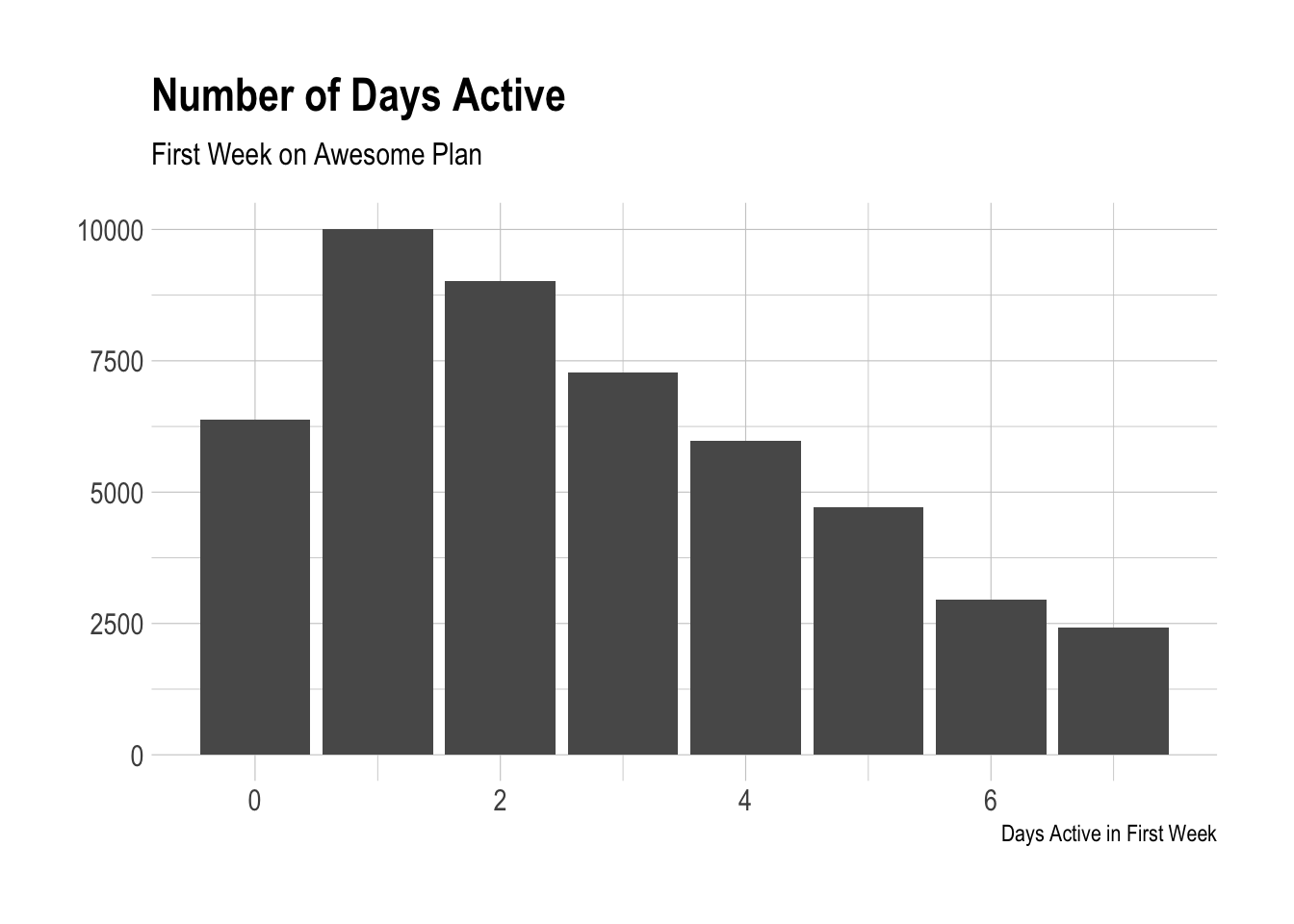
It’s striking to see again that many users that were not active at all during their first week on the Awesome plan! Our definition of “active” here is having scheduled at least one post with Buffer on any given day. Let’s look at profiles now.
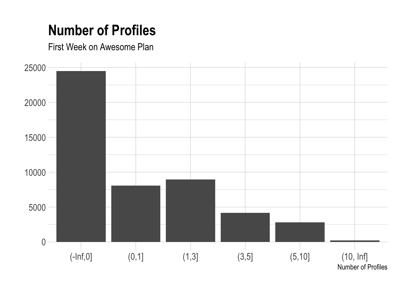
We can see that most awesome users don’t add any profiles in their first week on the Awesome plan? Could it be that they had already been connected? What is going on there?
Moving on, we should look at the distribution of the number of updates Awesome users created in their first week on the plan.
This is the type of distribution we’d expect to see. Most users create low number of updates, but there is a long tail of users that create many updates during their first week on the Awesome plan. Somehow a few users manage to create tens of thousands of them. How?
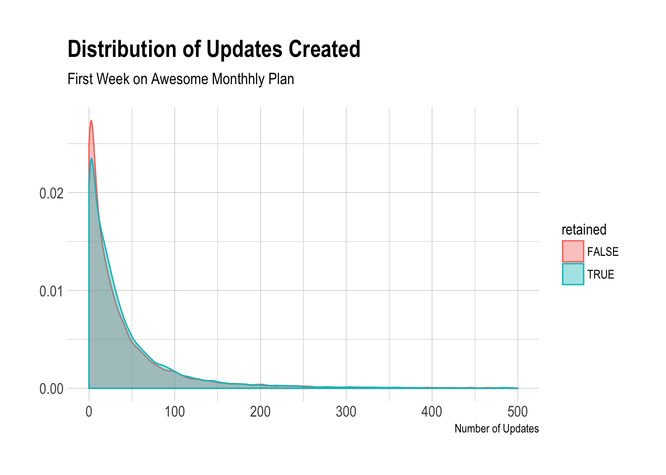
We can calculate the 99th percentile for updates again, in case there are strange outliers.
# get quantiles
quantile(awesome$updates, probs = c(0.25, 0.5, 0.75, 0.9, 0.99))
## 25% 50% 75% 90% 99%
## 6 21 51 106 445The 90th percentile is 106 updates and the 99th is 317 updates created in the first week, so we might remove users that have created 400 or more updates in their first week. That’s a lot!
# remove potential outliers
awesome <- awesome %>%
  filter(updates < 400)
Now let’s run a logistic regression model to see how these features correlate with a user being retained for six months.
# build model
mod <- glm(retained ~ profiles + updates + days_active + plan_id, data = awesome, family = 'binomial')

# summarise model
summary(mod)
##
## Call:
## glm(formula = retained ~ profiles + updates + days_active + plan_id,
## family = "binomial", data = awesome)
##
## Deviance Residuals:
## Min 1Q Median 3Q Max
## -2.7759 -1.2070 0.2571 1.0792 1.3374
##
## Coefficients:
## Estimate Std. Error z value Pr(>|z|)
## (Intercept) 3.2829605 0.0531479 61.770 < 2e-16 ***
## profiles -0.0193040 0.0048597 -3.972 7.12e-05 ***
## updates -0.0005385 0.0002205 -2.442 0.0146 *
## days_active 0.0810522 0.0062563 12.955 < 2e-16 ***
## plan_idpro-monthly -3.2654534 0.0521844 -62.575 < 2e-16 ***
## ---
## Signif. codes: 0 '***' 0.001 '**' 0.01 '*' 0.05 '.' 0.1 ' ' 1
##
## (Dispersion parameter for binomial family taken to be 1)
##
## Null deviance: 61873 on 48162 degrees of freedom
## Residual deviance: 52051 on 48158 degrees of freedom
## AIC: 52061
##
## Number of Fisher Scoring iterations: 6Alright, we can see here that there is a strong correlation between the likelihood of being retained for six months and the number of profiles, updates, and days active. We control for plan type here.
The number of updates sent and the number of days active do have a strong correlation - however, interestingly, the relationship between updates and the likelihood of being retained is negative! We will need to investigate further.
Let’s first look at the number of days active.
Days Active in First Week
Remember we define a user as “active” on a day if he or she creates at least one update with Buffer on that day. Let’s look at the proportion of users that were retained for each number of days active in the first week on the Awesome plan.
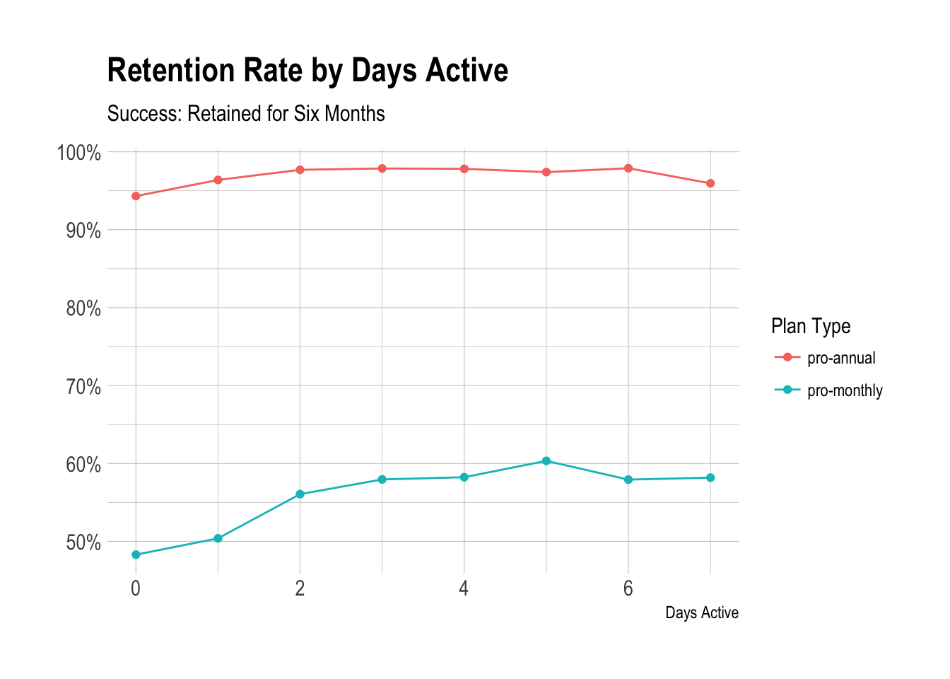
We can see that, for monthly plans, being active for at least two days during the first week on the plan increases the likelihood of being retained, only by around 5% though.
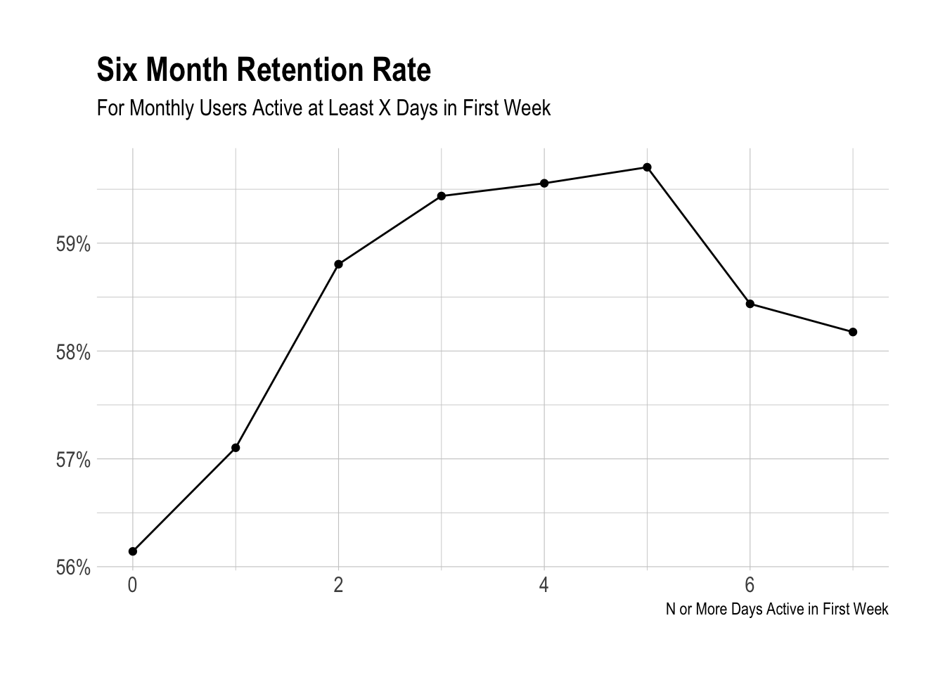
We can see here that the biggest jump comes from being active at least two days. However, this jump is pretty small, only a couple of percentage points.
Number of Profiles
We’ll take the same approach for profiles.
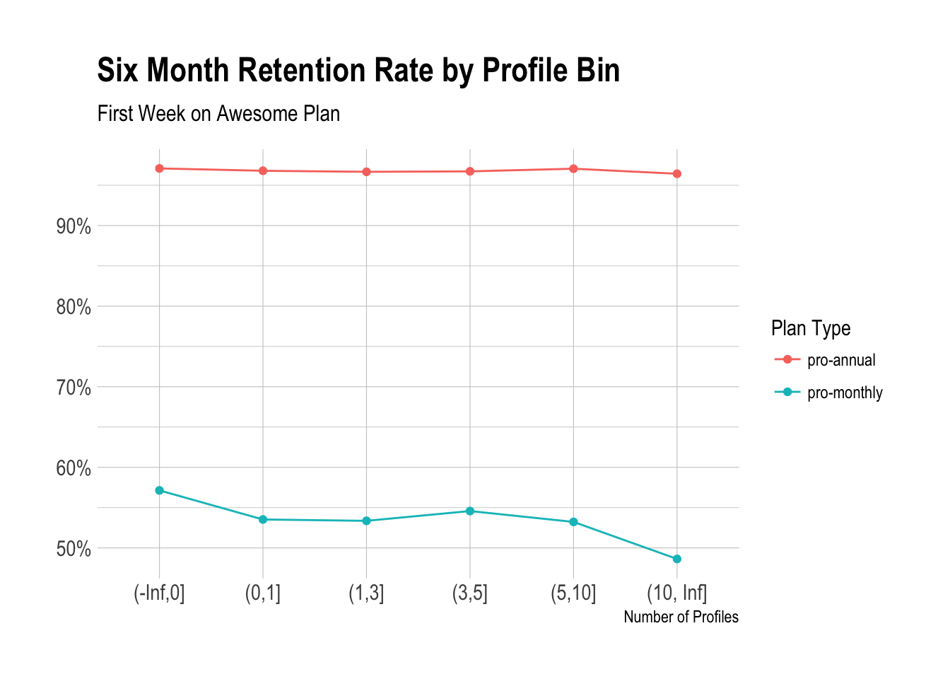
We can see the negative correlation between profiles added likelihook of being retained. There doesn’t seem to be too much here…
Let’s look at updates.
Updates
# define cuts
cuts <- c(0, 10, 50, 100, 200, 500)

# plot distribution of updates
awesome %>%
  filter(plan_id == 'pro-monthly') %>%
  mutate(update_bin = cut(updates, breaks = cuts, include.lowest = TRUE)) %>%
  group_by(plan_id, update_bin, retained) %>%
  summarise(users = n_distinct(customer_id)) %>%
  mutate(percent = users / sum(users)) %>%
  filter(retained) %>%
  ggplot(aes(x = update_bin, y = percent)) +
  geom_bar(stat = 'identity') +
  theme_ipsum() +
  scale_y_continuous(labels = percent) +
  labs(x = "Number of Updates", y = NULL, title = "Six Month Retention Rate by Update Bin",
       subtitle = "First Week on Awesome Plan")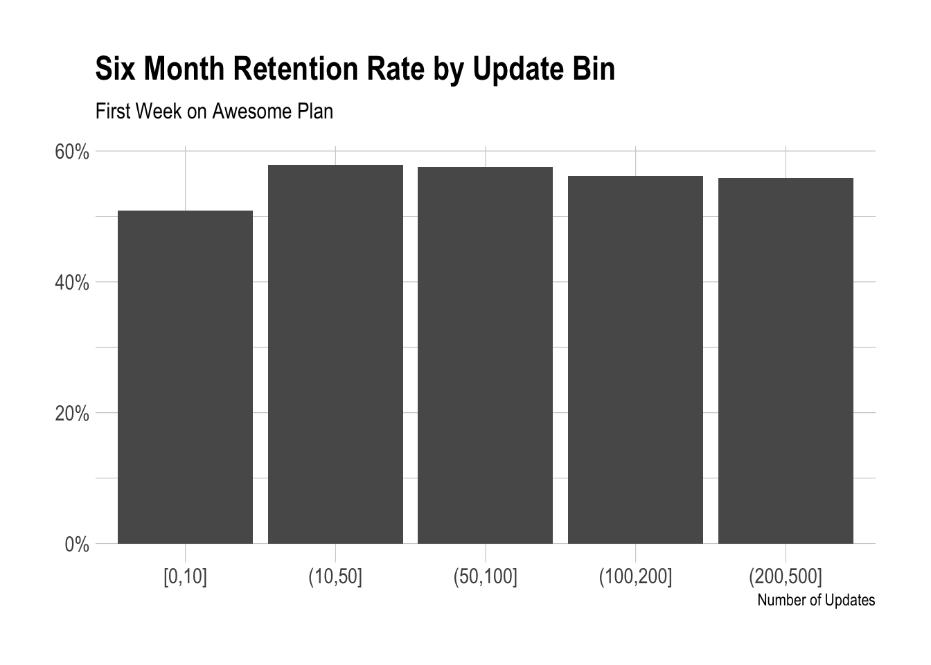
There does appear to be a jump when you go from 9-10 to 11-50 updates. Let’s dig a little deeper.
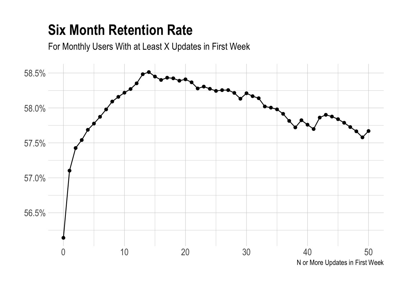
Interestingly, there is a strong positive correlation until we reach around 15 updates. I suppose we could use 10 updates in the first week as an activation metric. I’m not sure.
Let’s suppose that we say that’s it. A user is activated if he or she created 10 or more updates during the first week on the plan. How would that affect the retention rates?
# define activation
awesome %>%
  mutate(activated = updates >= 10) %>%
  group_by(activated, retained) %>%
  summarise(users = n_distinct(customer_id)) %>%
  mutate(percent = users / sum(users))
## # A tibble: 4 x 4
## # Groups: activated [2]
## activated retained users percent
## <lgl> <lgl> <int> <dbl>
## 1 F F 5828 0.371
## 2 F T 9876 0.629
## 3 T F 9834 0.311
## 4 T T 21751 0.689This might not be a good indicator. It only increases the likelihood of being retained by a few percentage points. :-
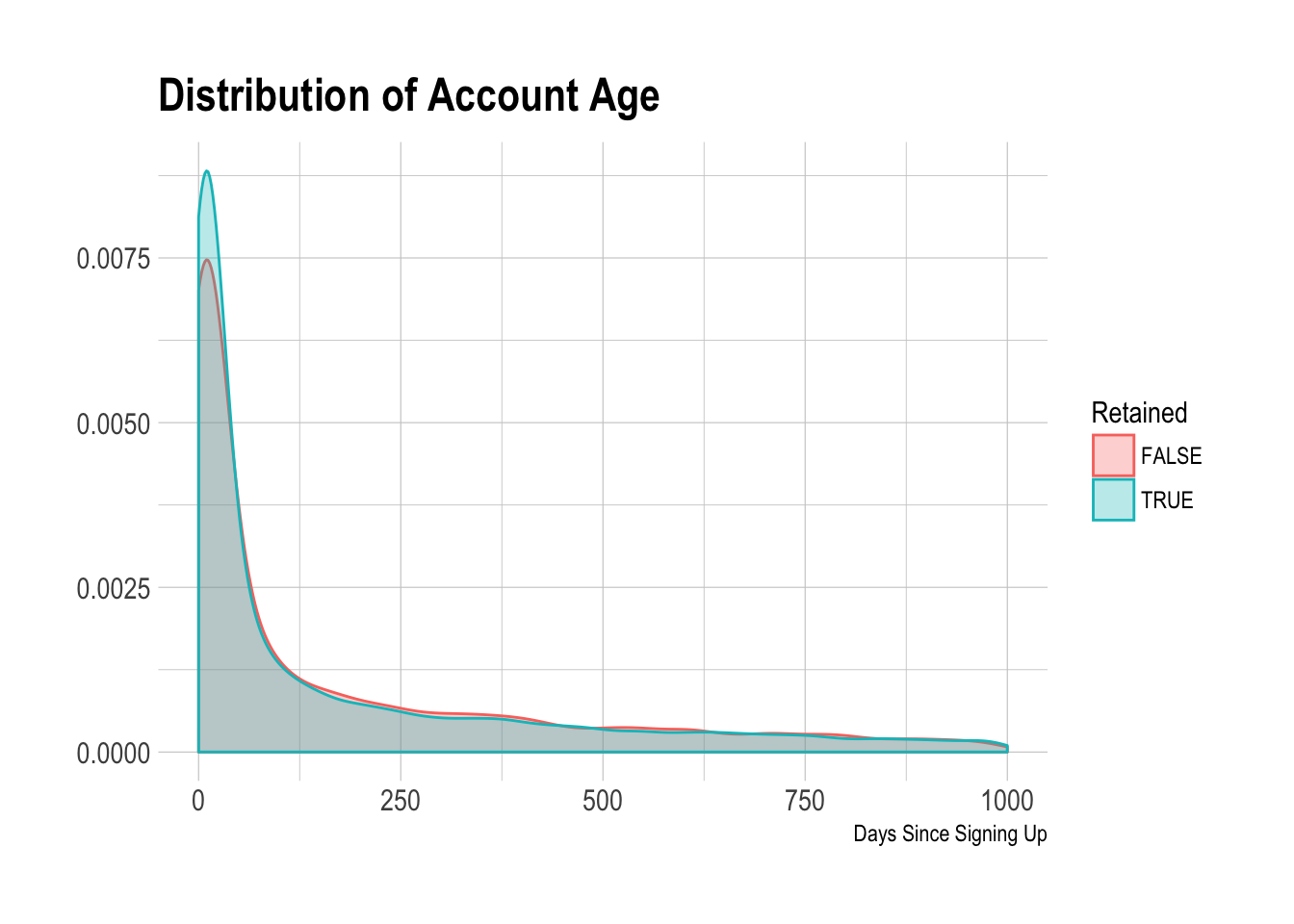
### Time Before Upgrading Just for kicks and giggles, let’s visualize the distribution on the number of days between the signup date and subscription start date.
We can see that the distribution is quite wide. A higher percentage of users that were retained started their subscriptions shortly after signing up.